






-
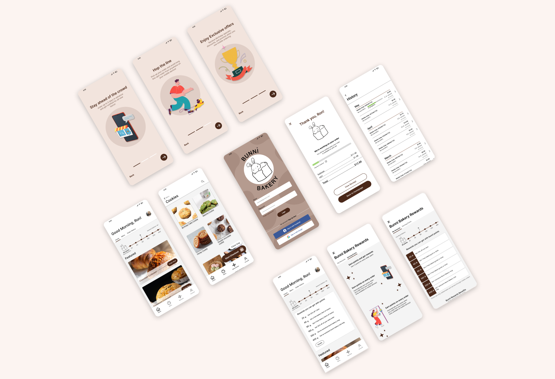
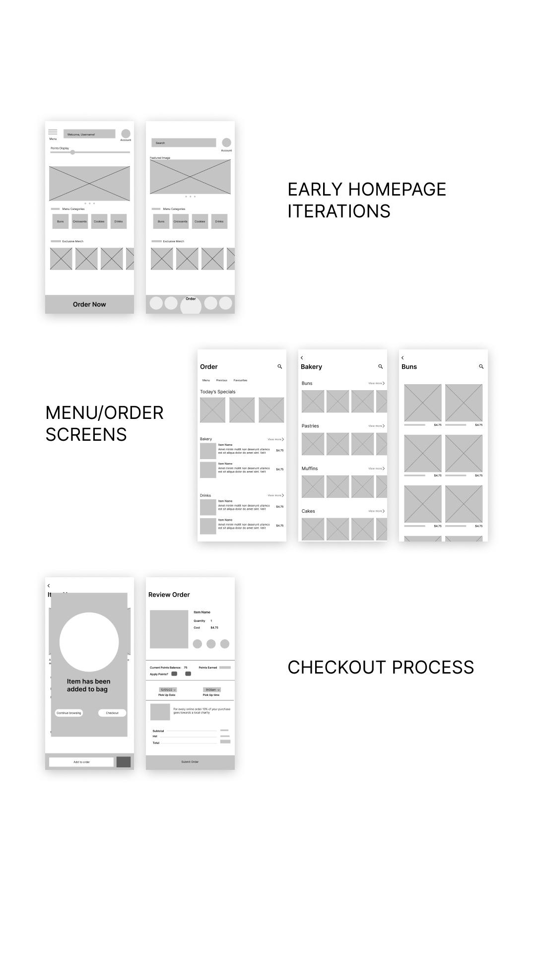
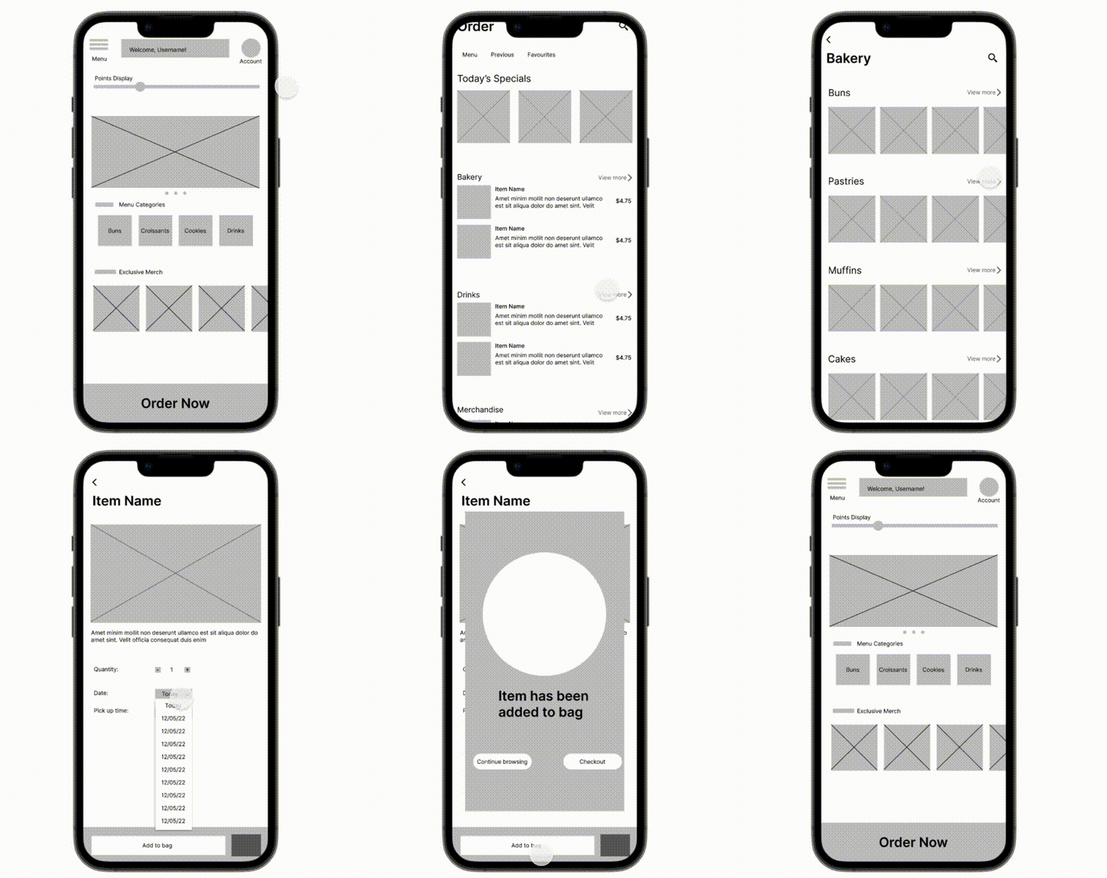
Digital Wireframes
-
Low-Fi Prototype
-
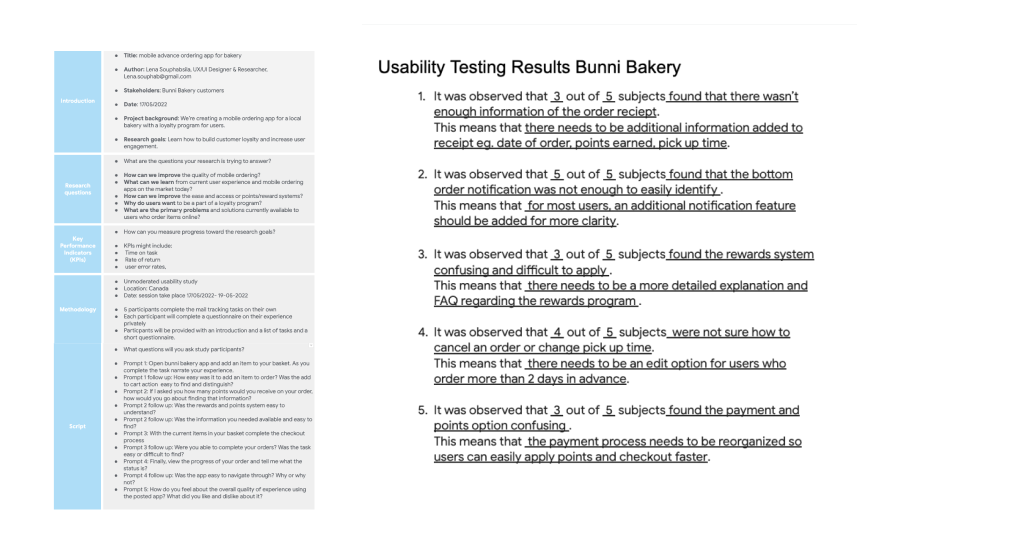
Usability Testing
Usability testing revealed that users
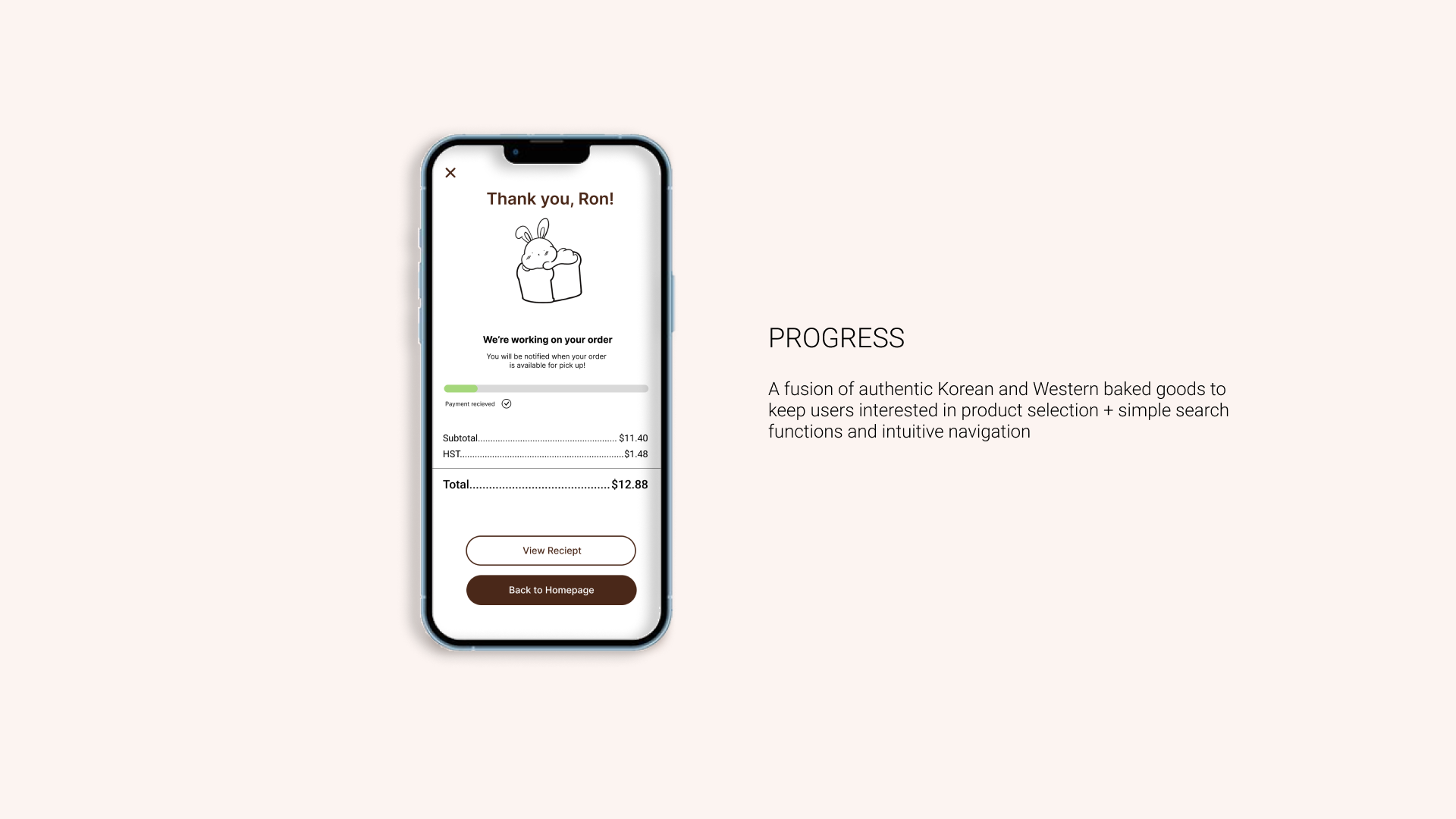
Want more details on the order receipt
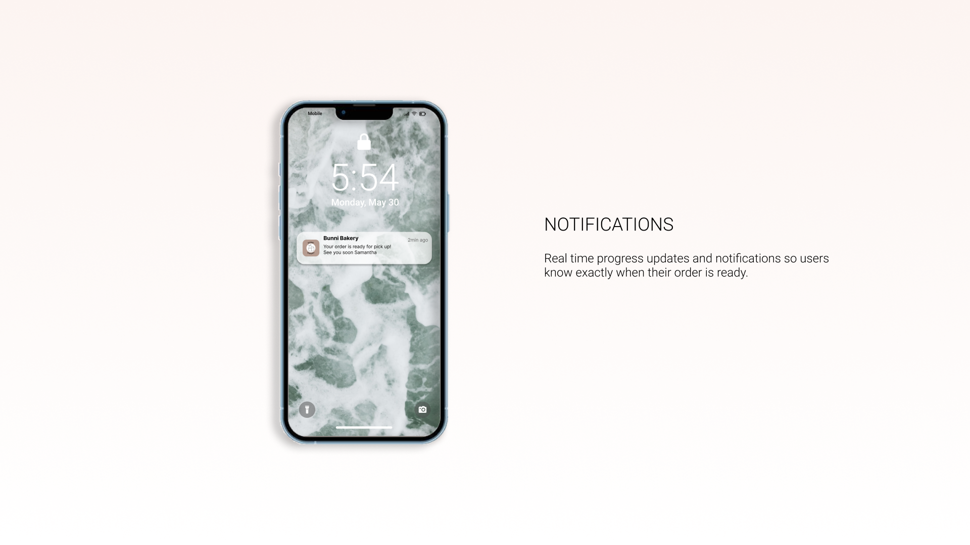
Order notifications were not easily identified when ready for pick up
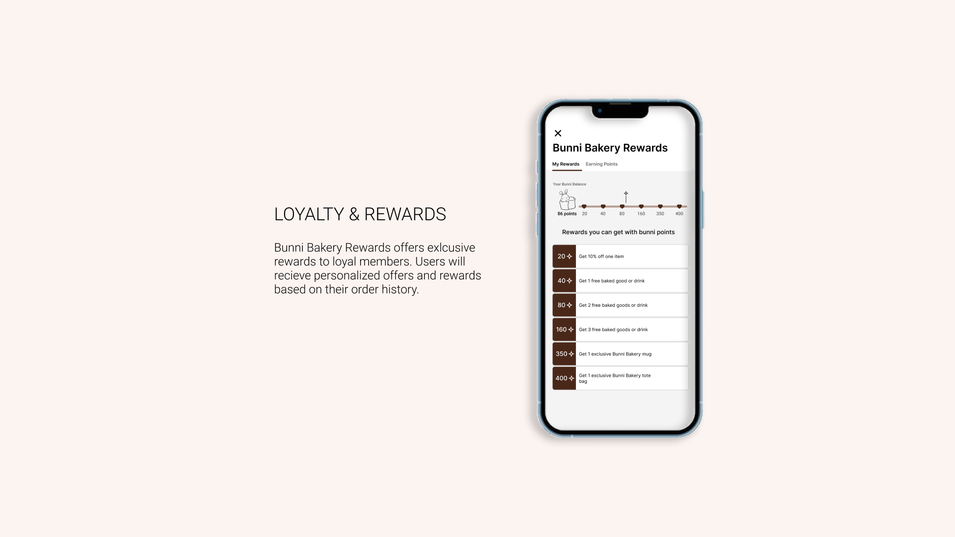
The rewards system was difficult to apply
Users were unsure how to change an order time or cancel an order completely.
-
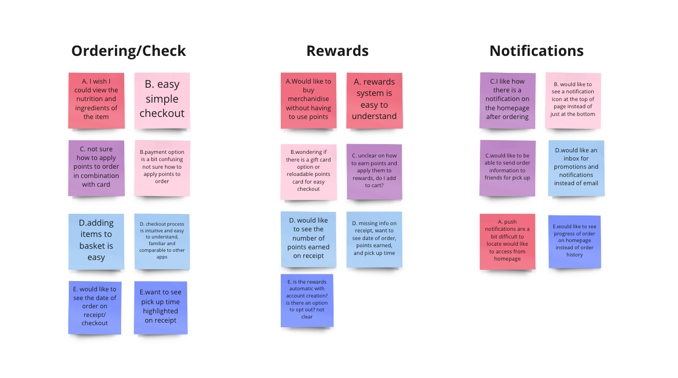
Affinity Diagram
Data collected from usability testing revealed user behavior and patterns in relation to 3 key features: order/checkout, rewards, and notifications.
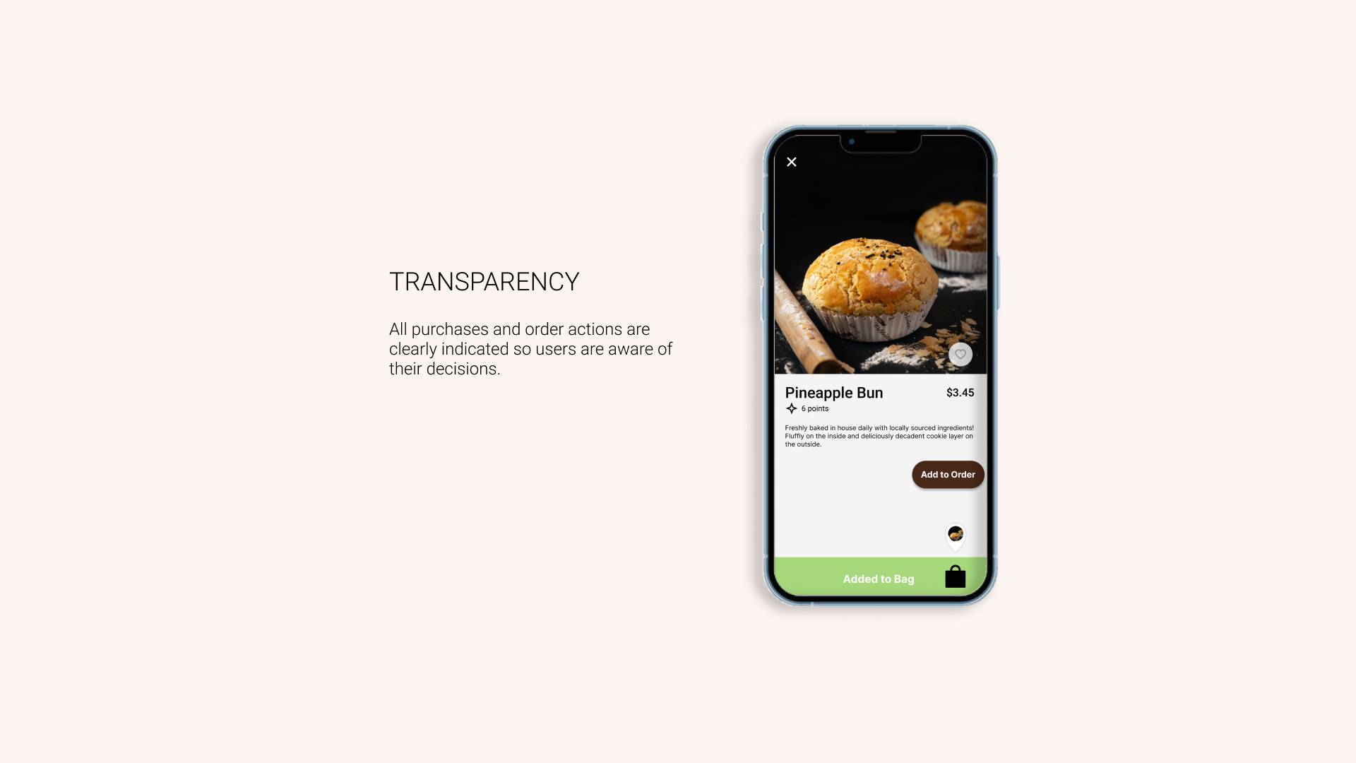
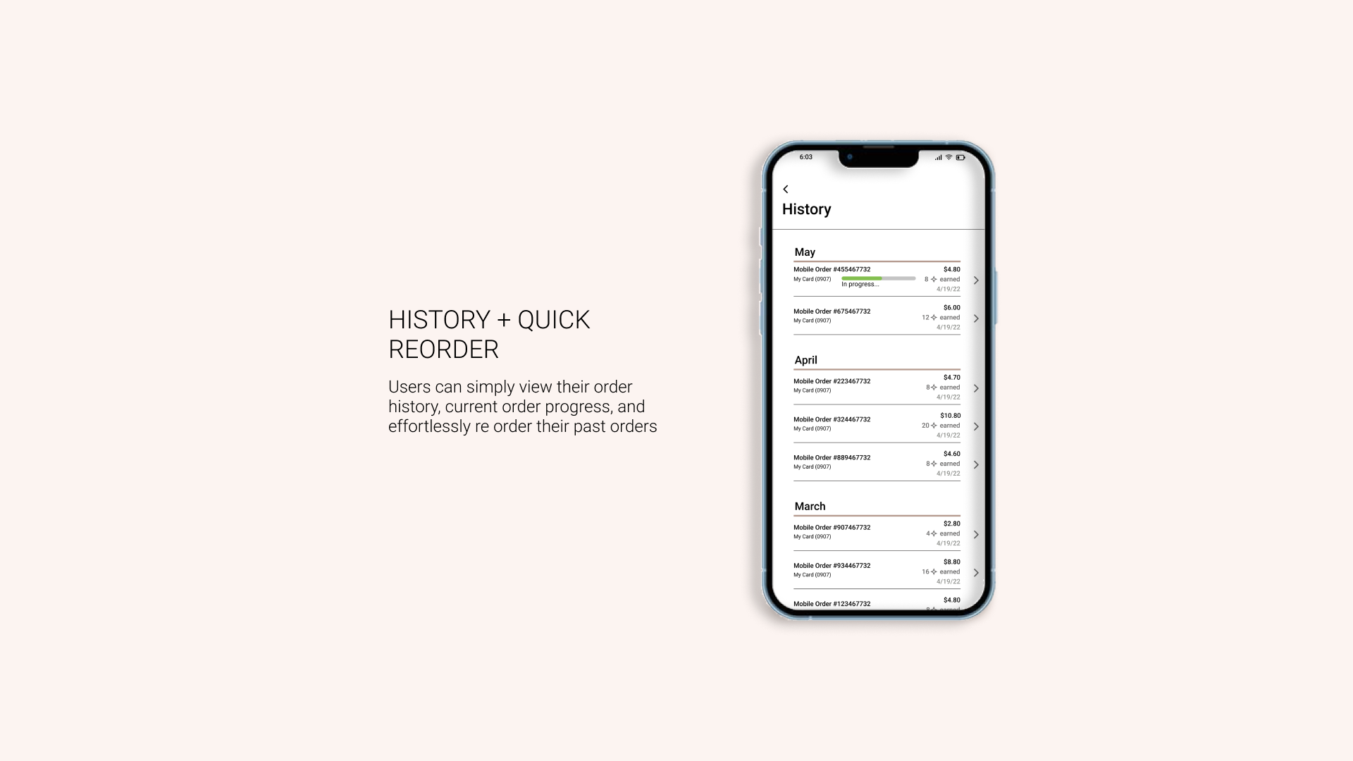
Users want transparency and easy access to information regarding their orders.
The rewards system can be simplified.
Notifications can be made more apparent with larger visual cues.

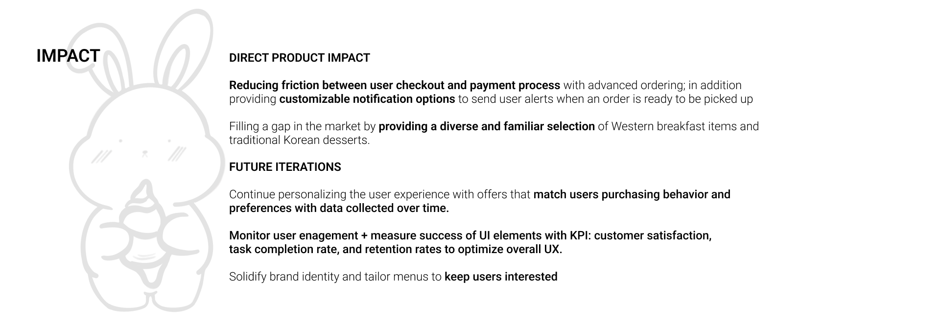
DESIGN OUTCOME

REFLECTIONS
Overall, the accessibility aspect of the app can be improved, there are many opportunities to improve the ordering process in ways that are more inclusive; for instance, I can implement mic options for users to order by voice only.
If I were to launch this app publically I would continue to research, validate, and iterate the checkout process, UI elements, and accessibility features. I believe that there is always room for improvement and even more opportunities to learn.