
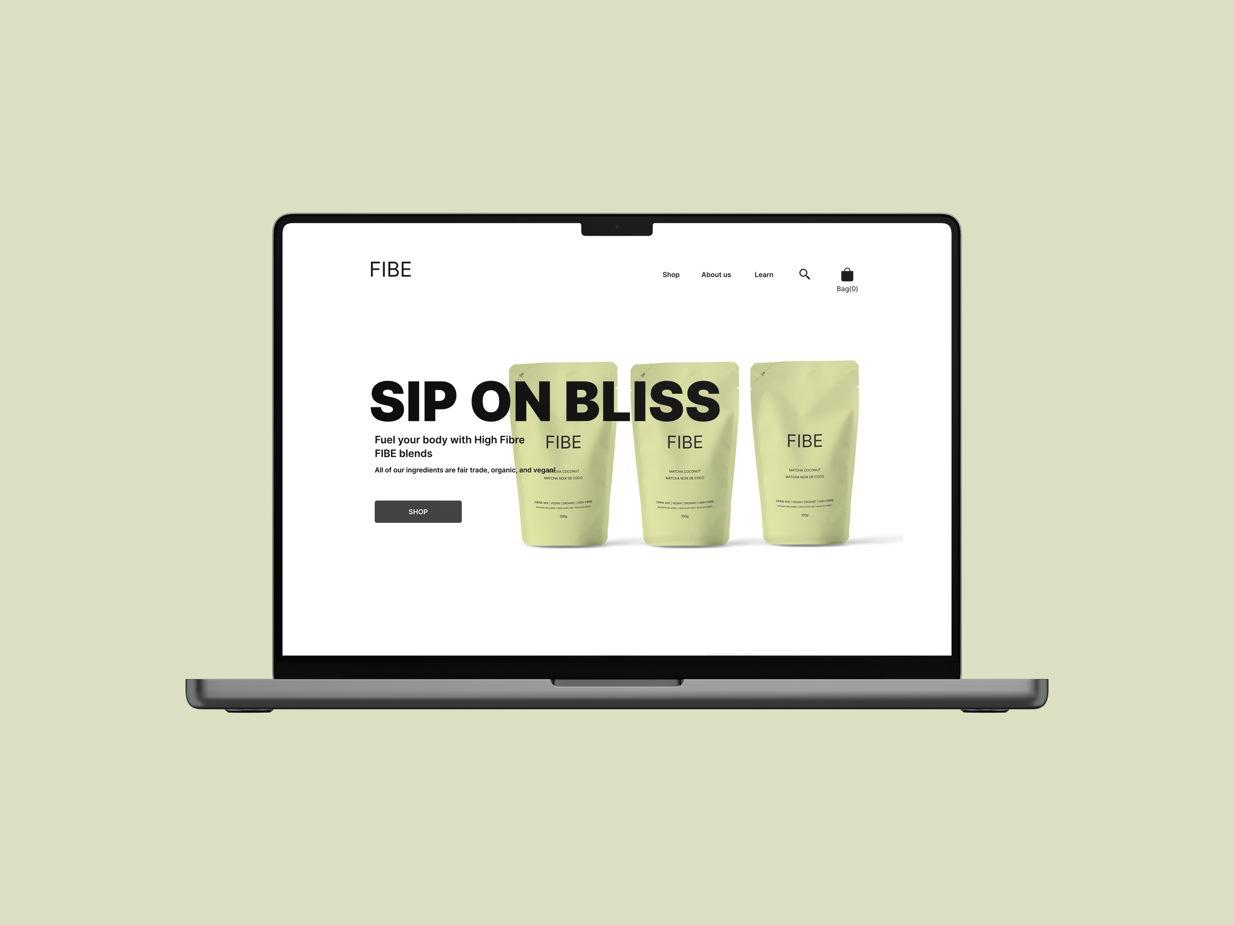
What the FIBE?
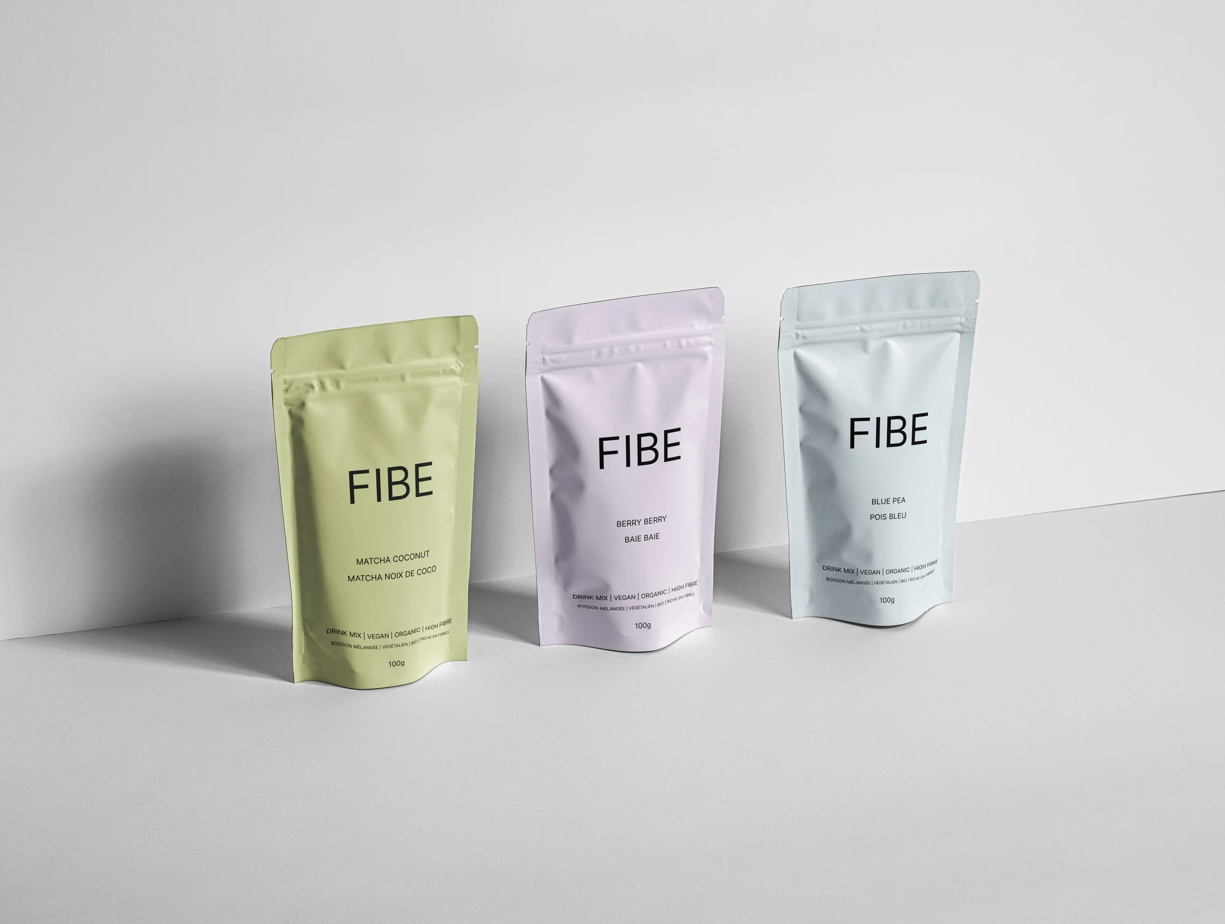
Fibe is a drink supplement company focusing on offering high fibre drink mixes so that users can easily reach their daily recommended fibre intake quickly, easily, and effectively.
-
Team
Individual
-
Role
Research
UX/UI
-
Duration
1 Week- Design Sprint
-
Tools
Figma
Photoshop
Version 1.0
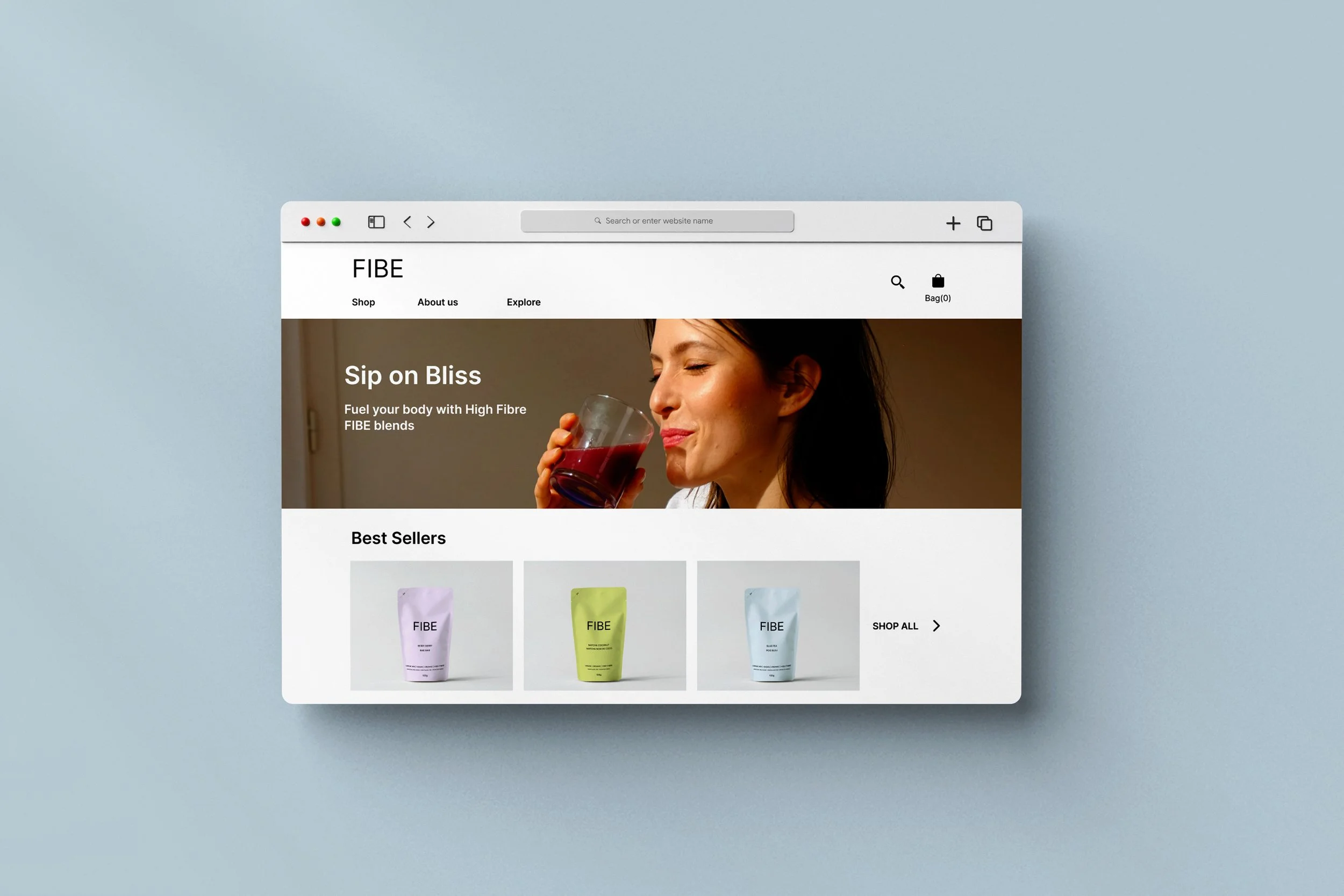
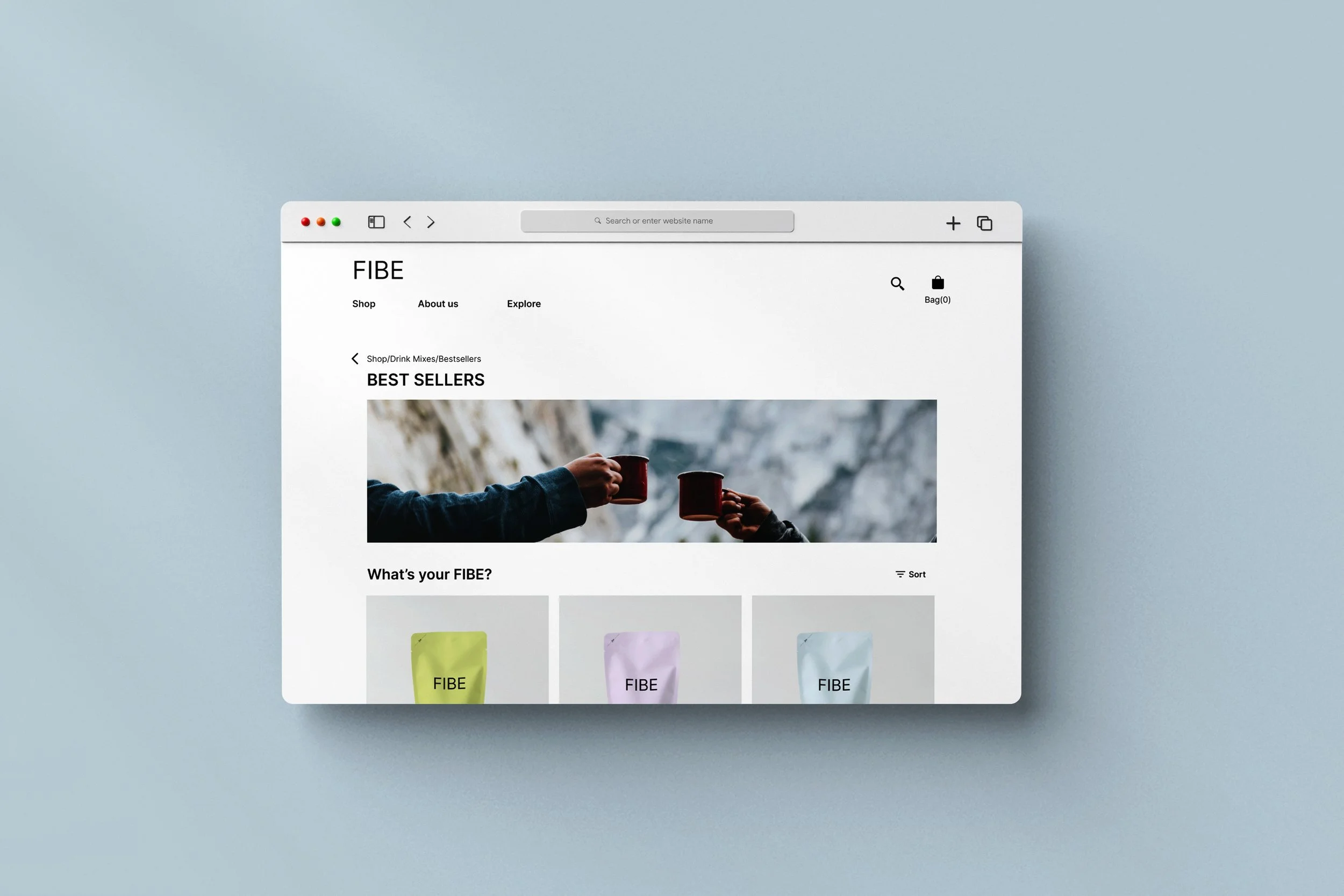
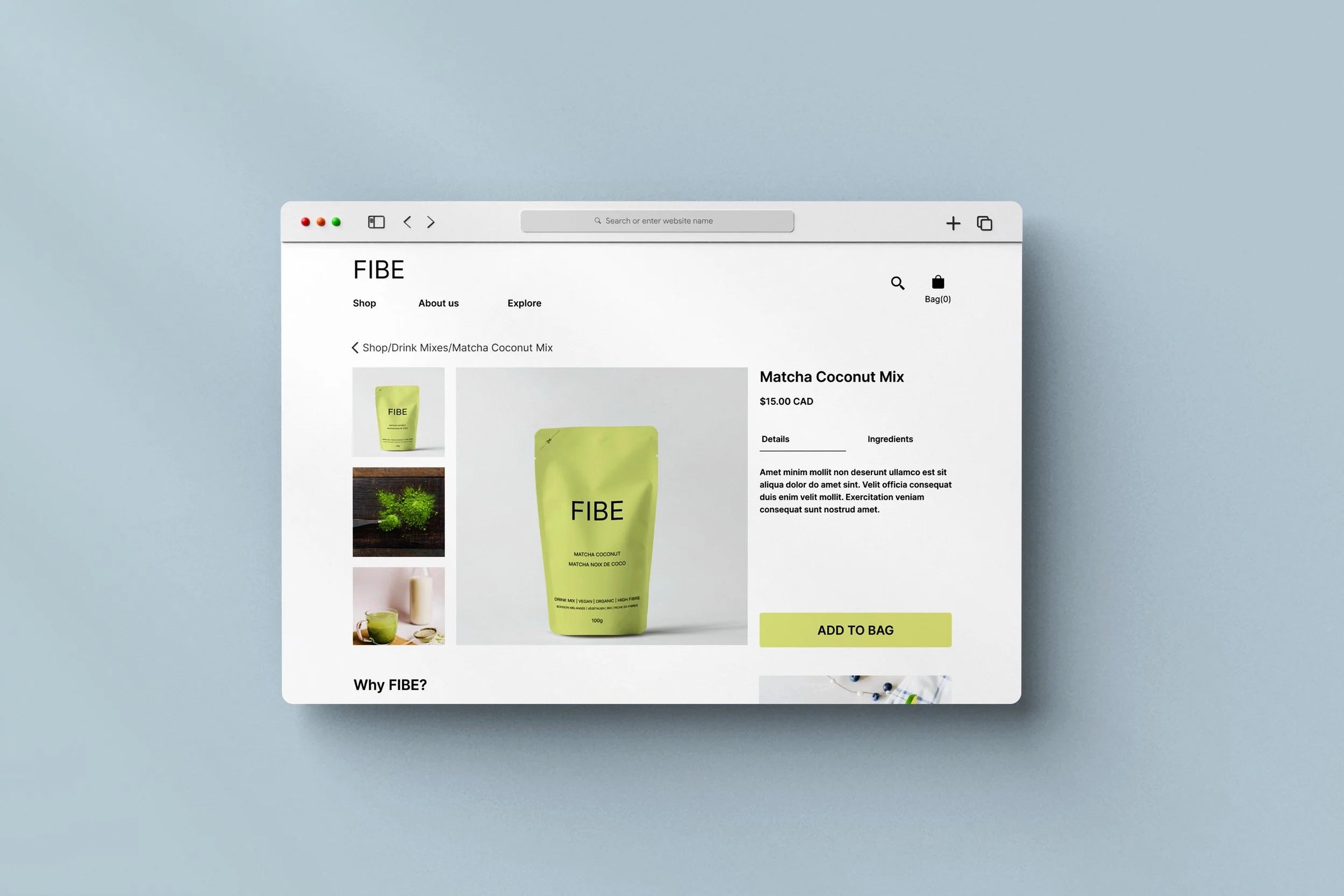
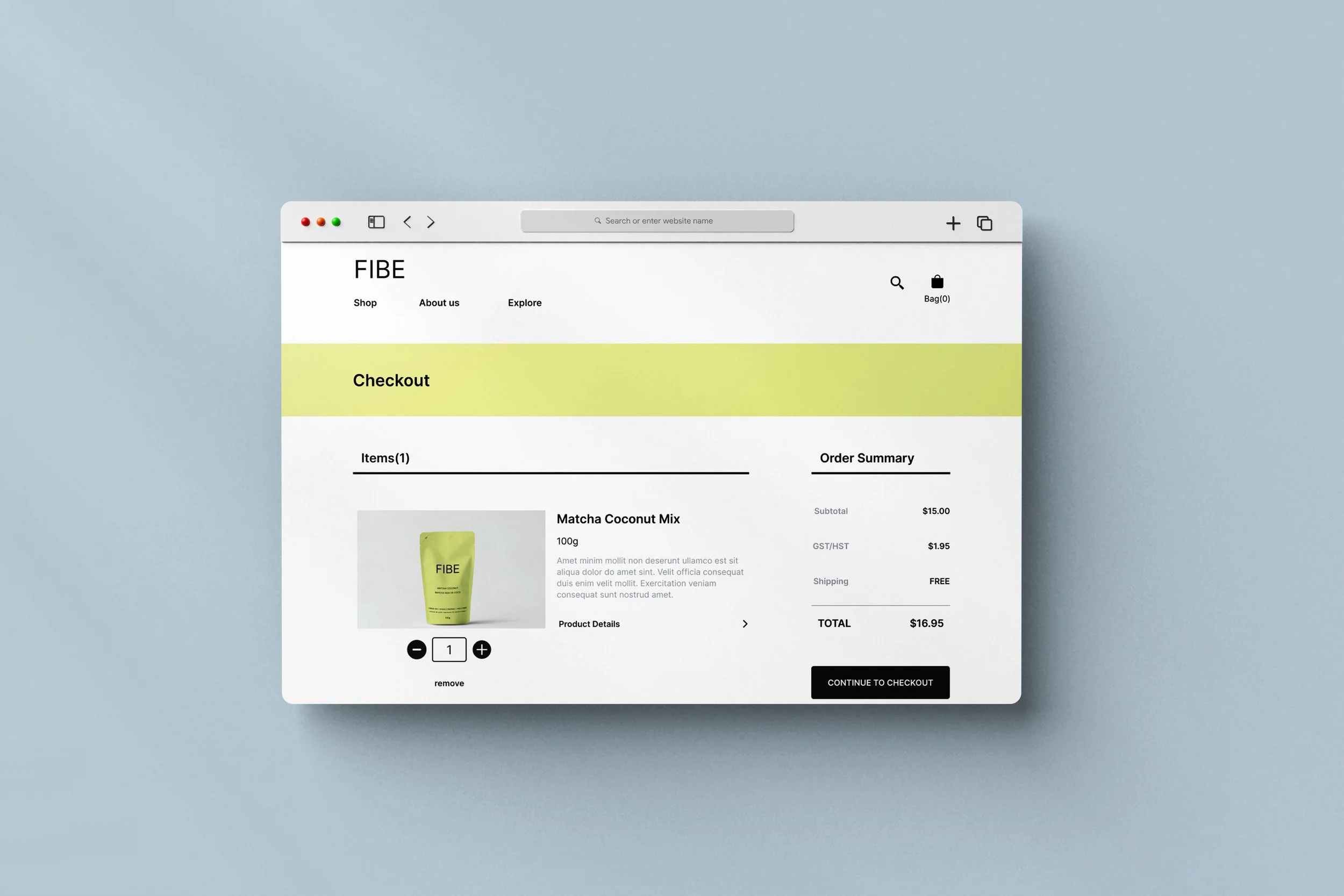
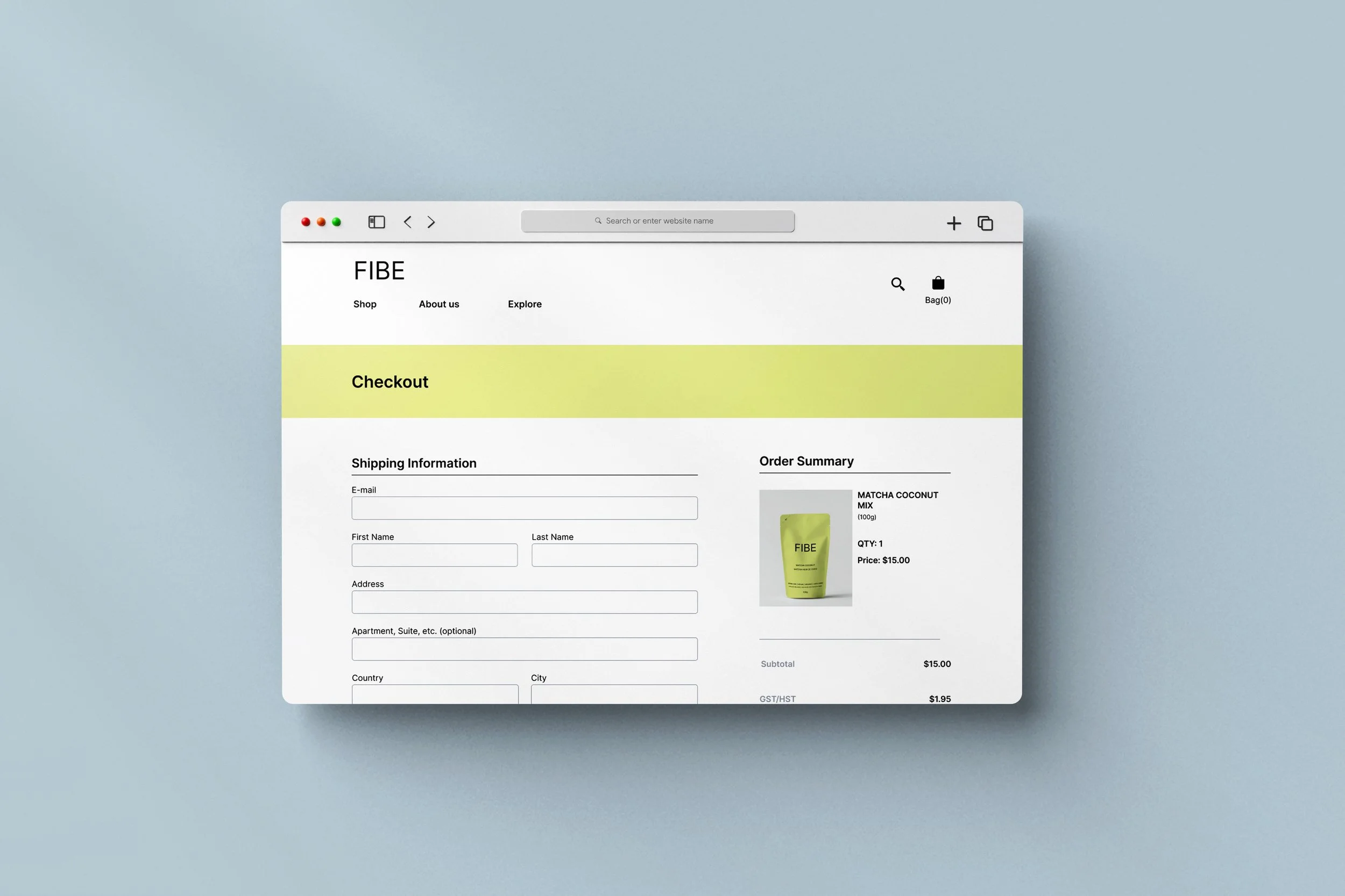
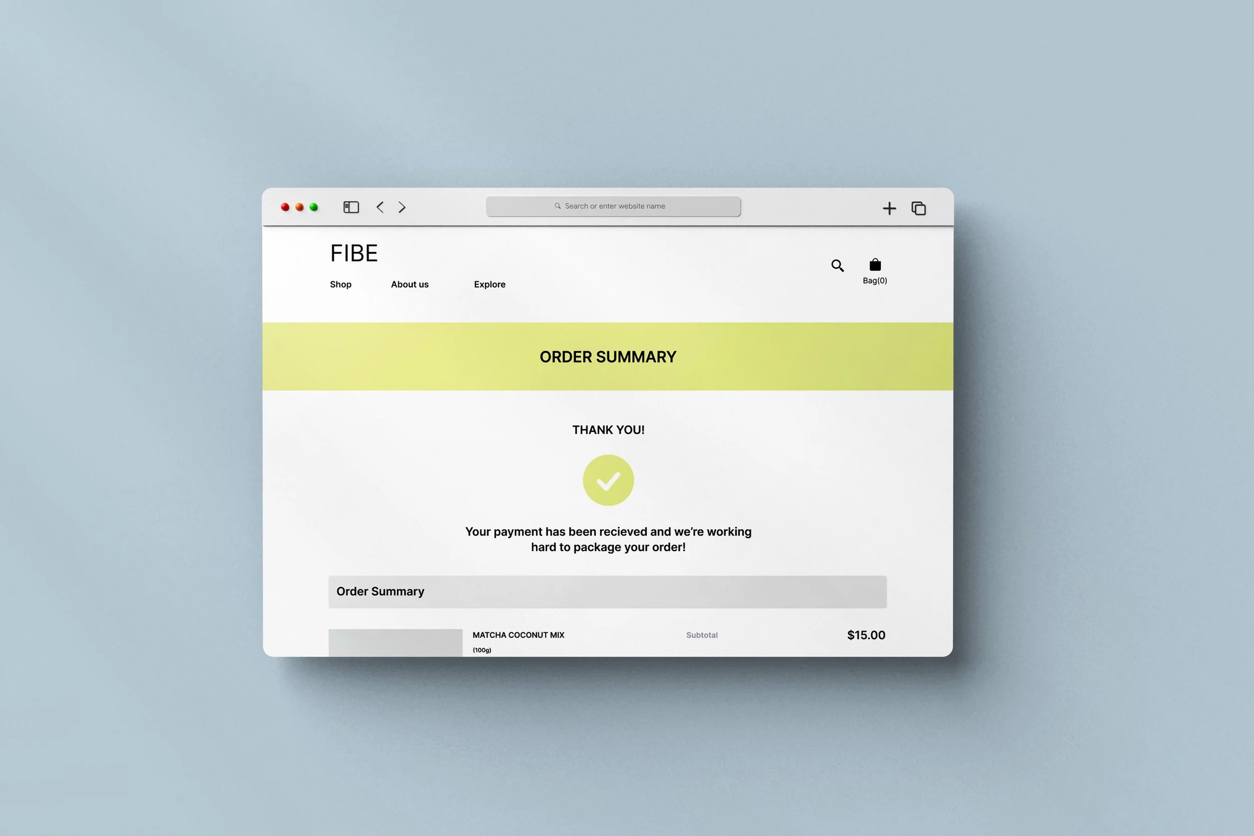
Version 2.0
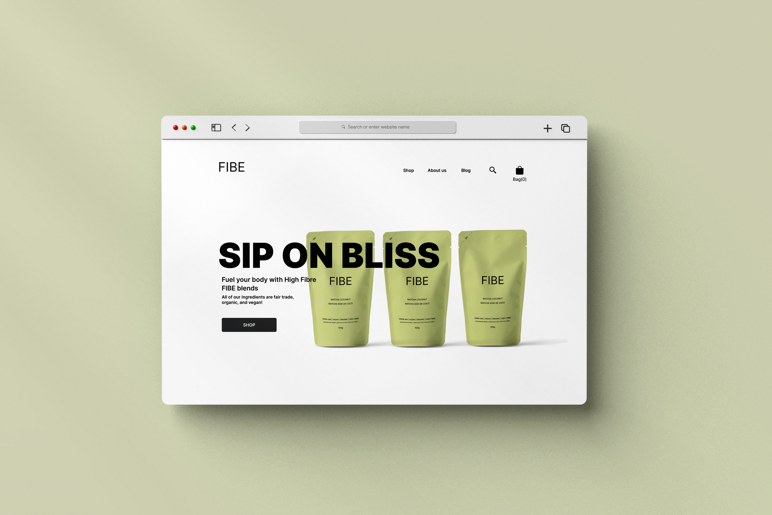
-
PROBLEM
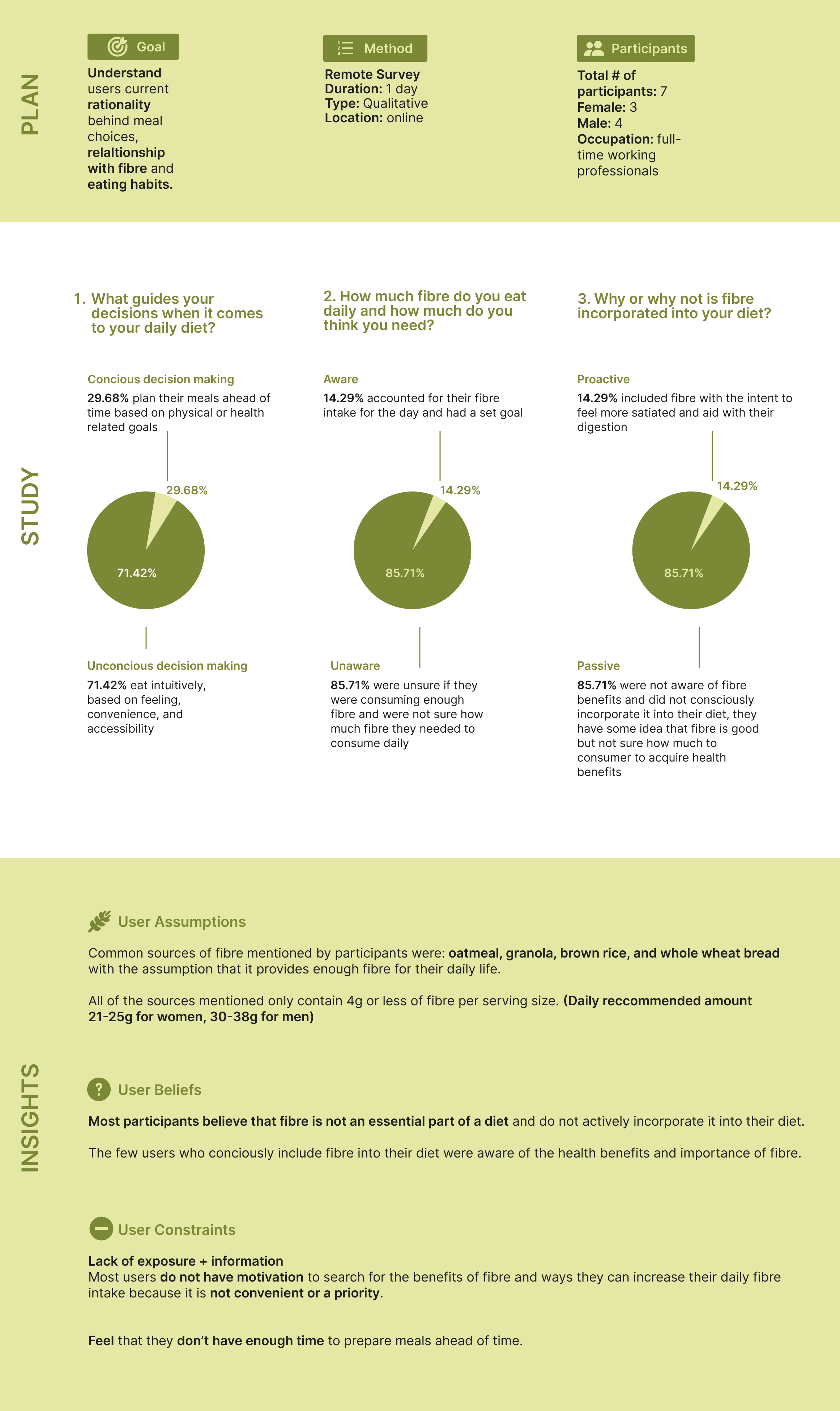
An estimated 95% of American adults and children do not consume recommended amounts of fibre.
Most quality sources of fibre come from fresh produce, however fruits and vegetables have one of the highest rates of food waste. People need a shelf-stable and easy method to reach the recommended daily fibre intake.
-
GOAL
Fill fibre intake gap and make it easier for users to reach their daily fibre intake
Provide sources of fibre that require minimal prep and minimize foodwaste.
So that users can reduce health risks associated with heart disease, stroke, hypertension, and obesity by introducing more fibre into their diet.
-
HYPOTHESIS
If users are made aware of the benefits of fiber, they will make a conscious effort to incorporate more fiber into their diet, so that they can effortlessly live a healthier and balanced life.
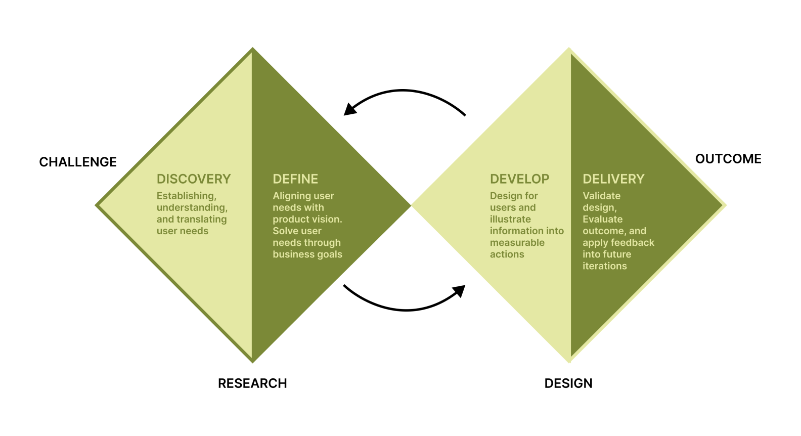
DESIGN PROCESS
USER RESEARCH
USER PERSONAS
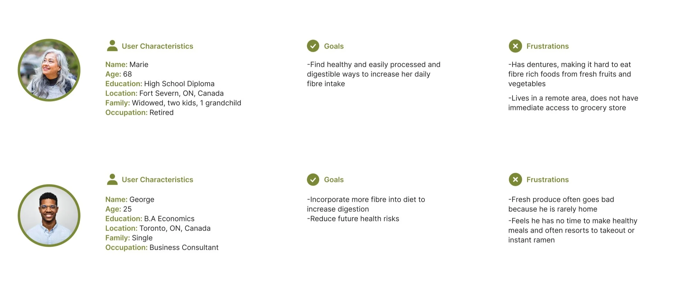
Personas were created based on user interviews and potential edge cases that were not observed in the study. These two personas represent the types of users who would benefit most from having a convenient and easily digestible source of fibre. The first group being an older demographic (baby boomers+ gen x) who are not able to chew on food as easily, the second being young adults (gen z + millennials) on the go who don’t have time to
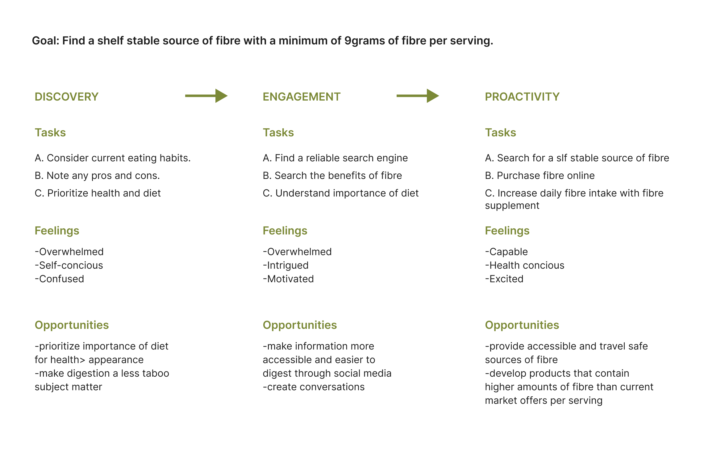
USER JOURNEY
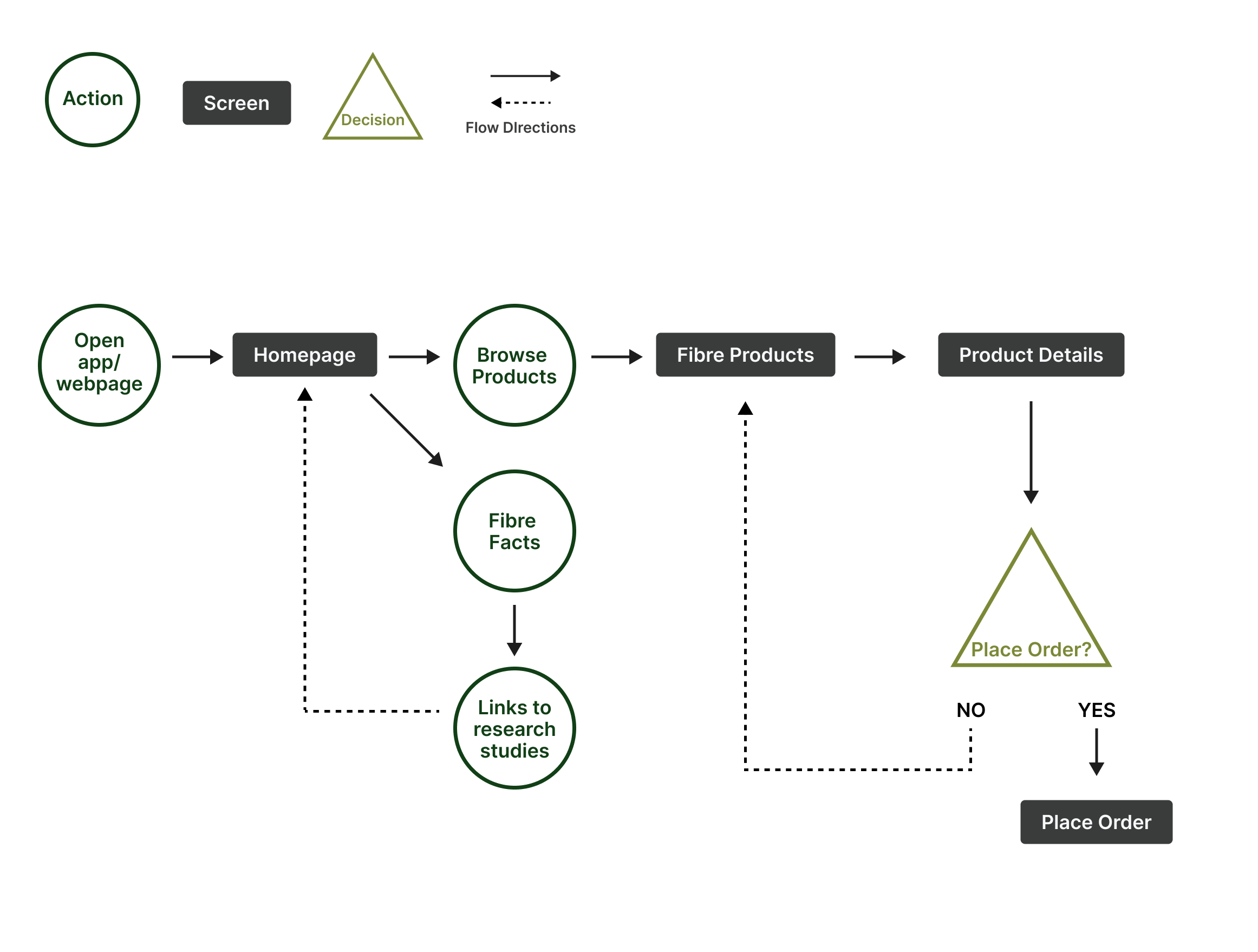
USER FLOW
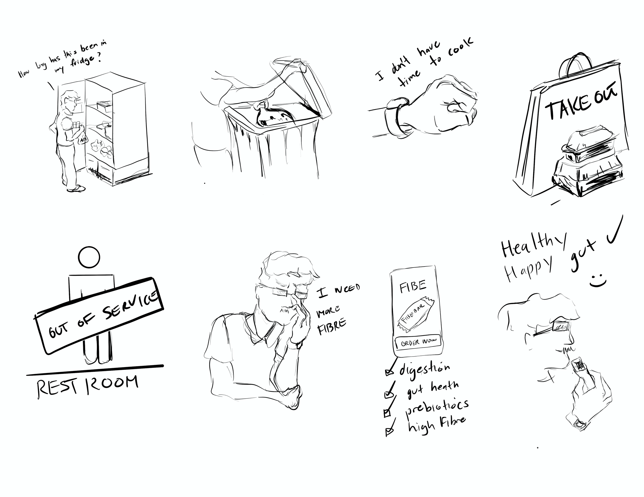
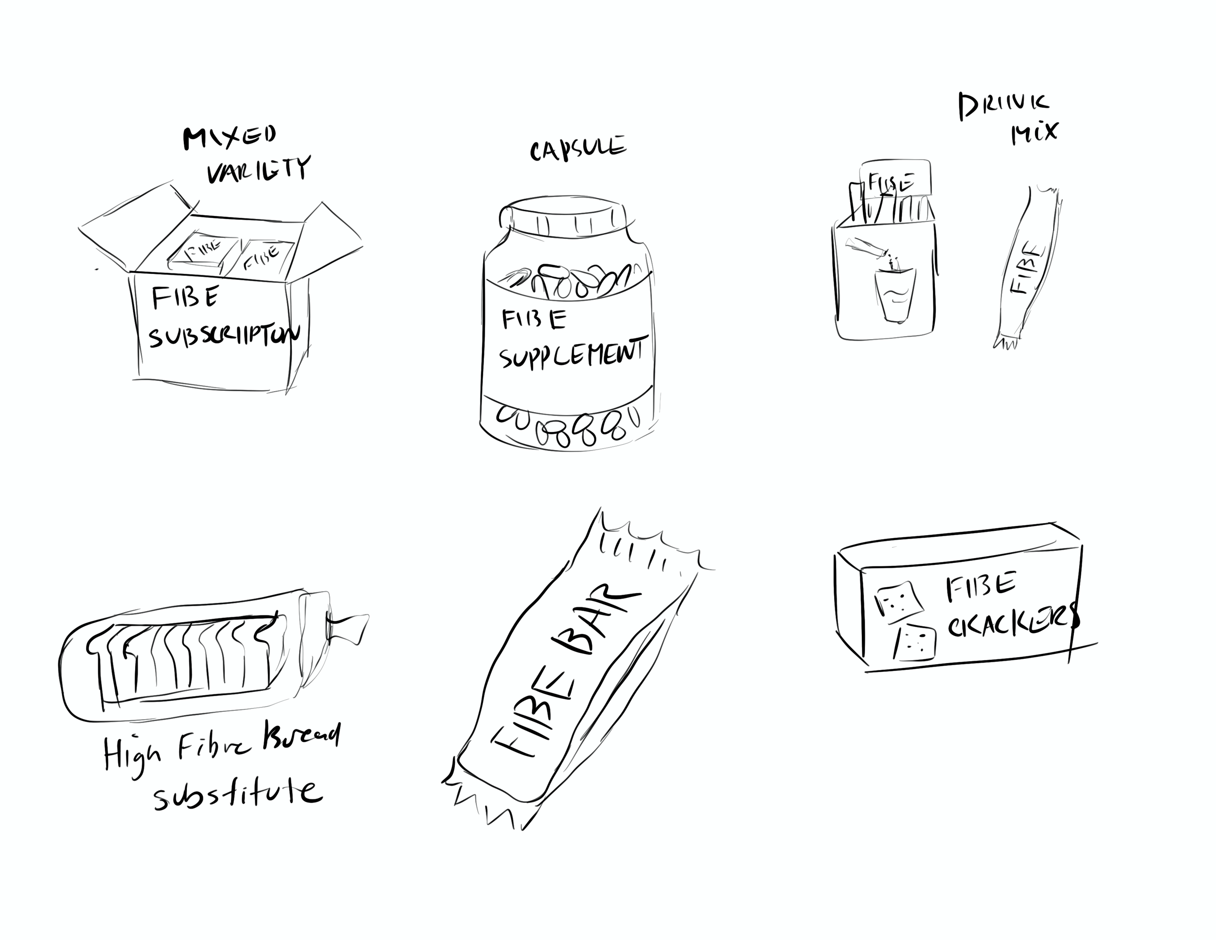
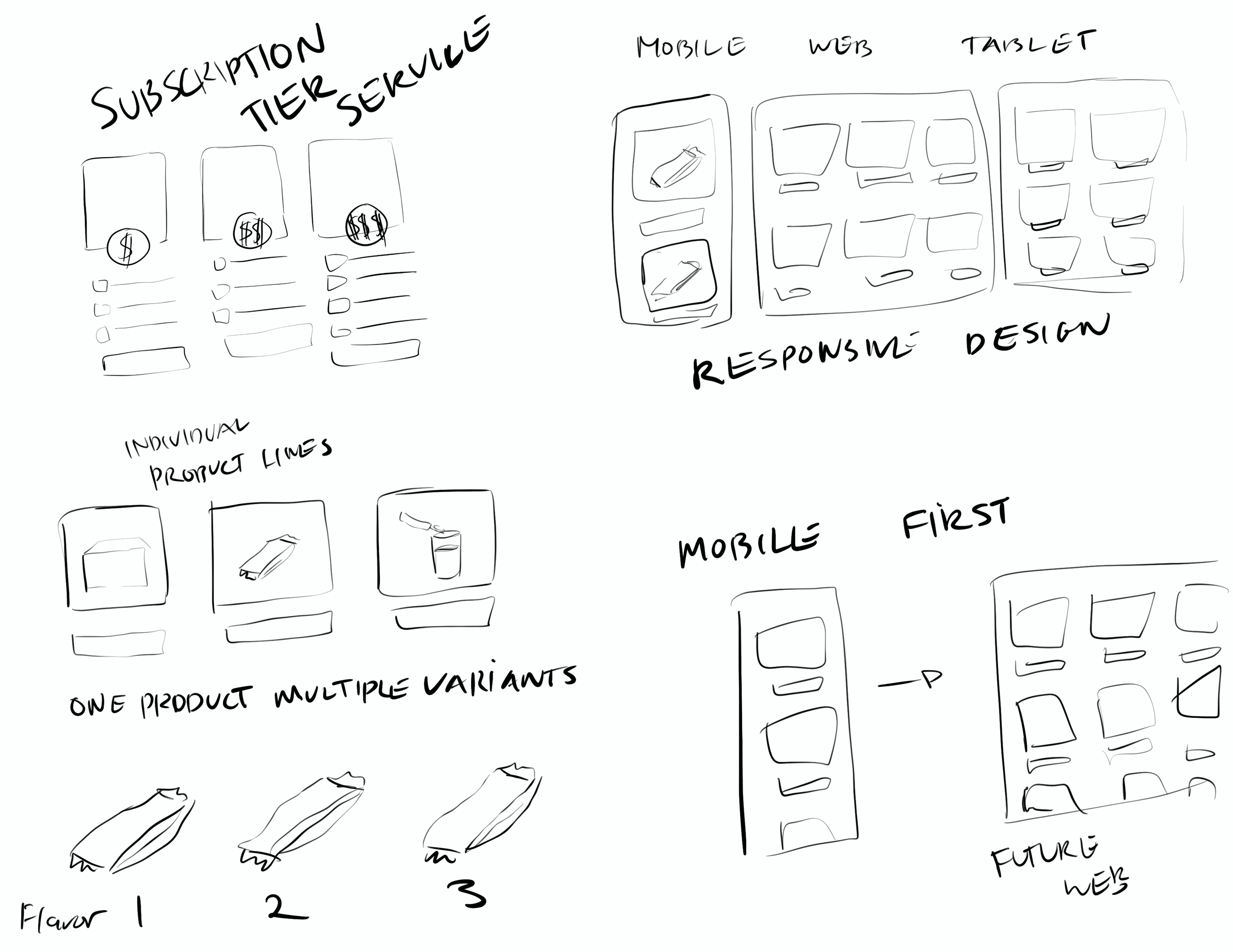
BRAINSTORMING + IDEATIONS
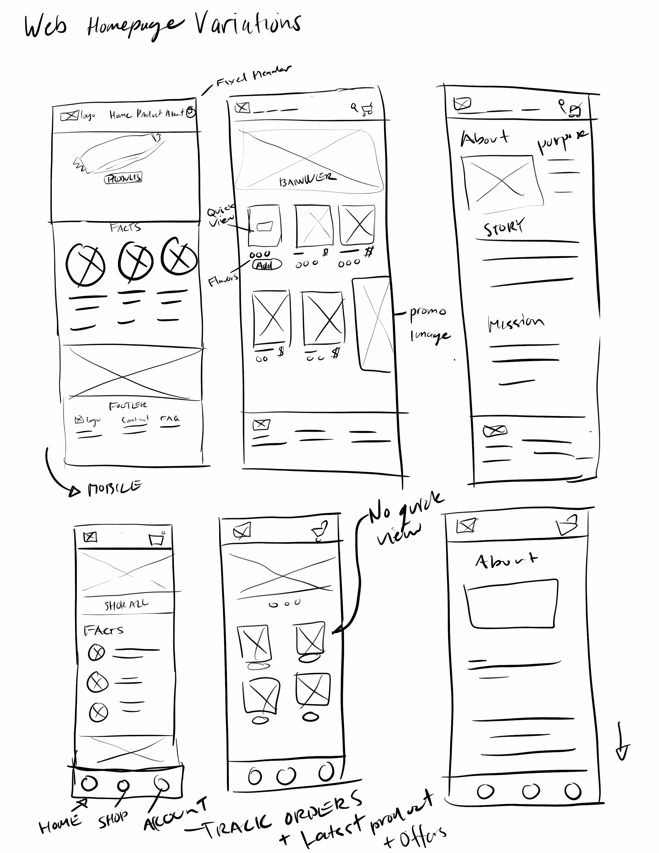
WIREFRAME SKETCHES
BRANDING
REFLECTIONS
I found that bringing awareness to health-related issues is difficult without having a professional background in it.
Despite having supporting secondary research most users are not interested in reading the evidence and want short, clear, and concise facts.
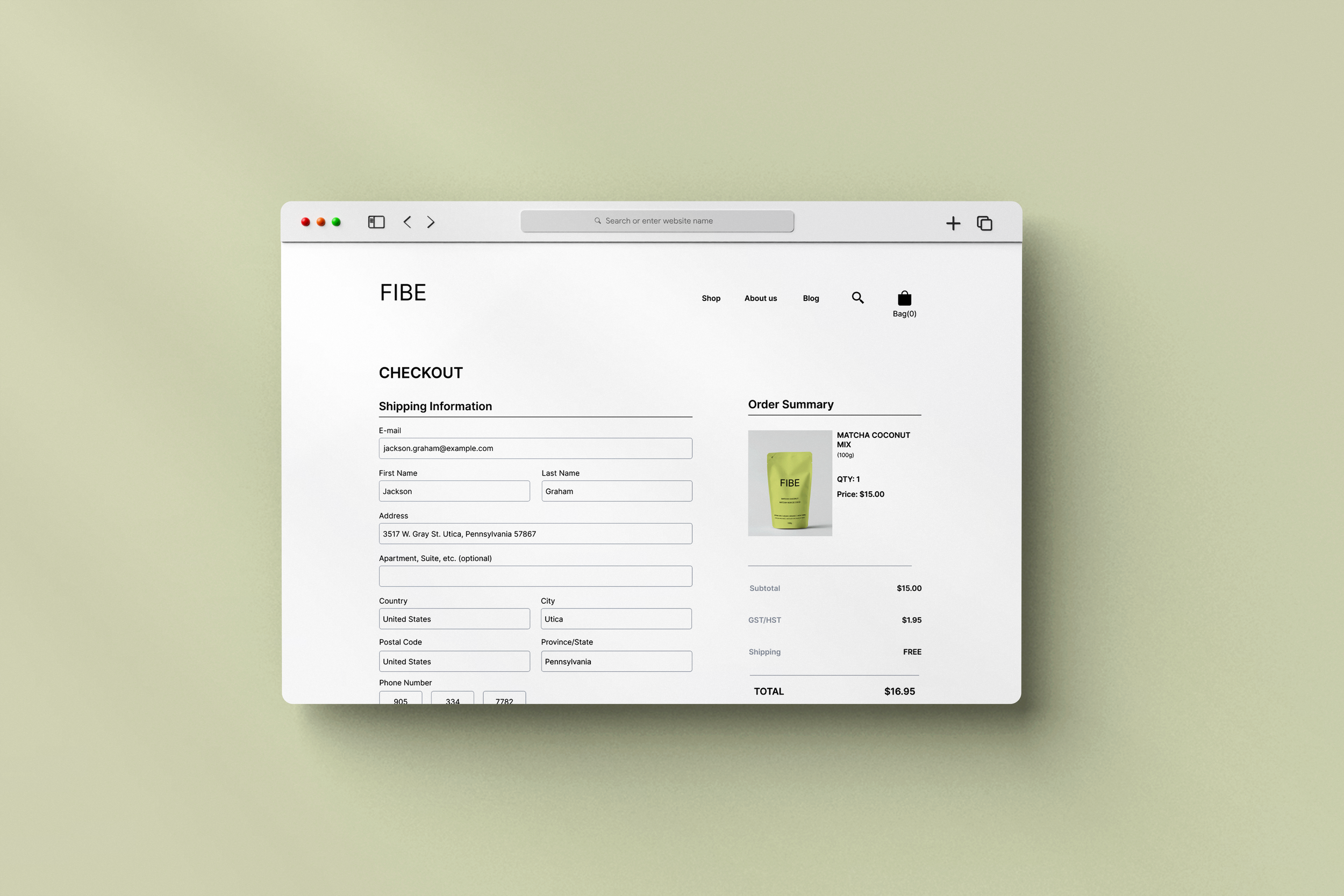
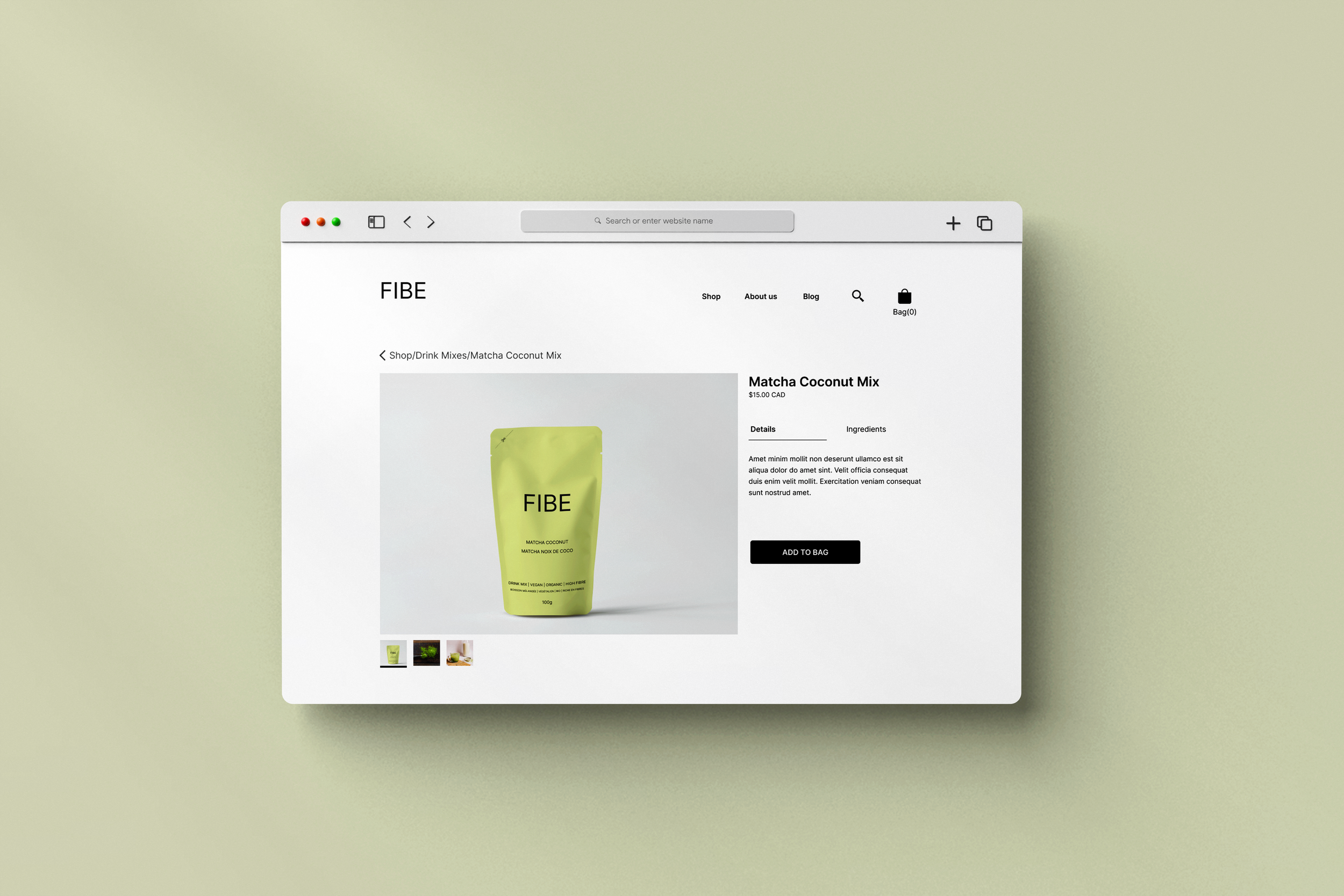
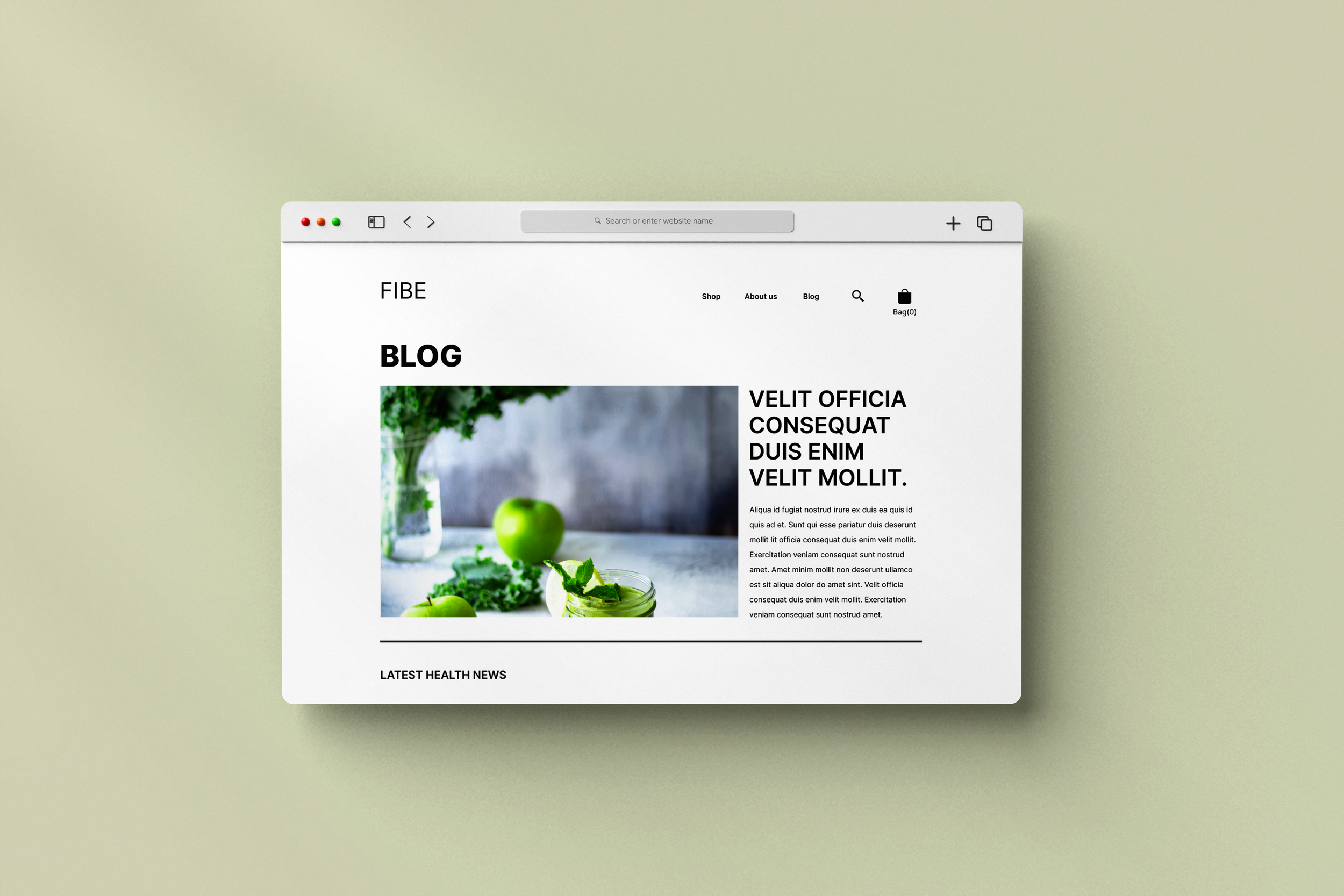
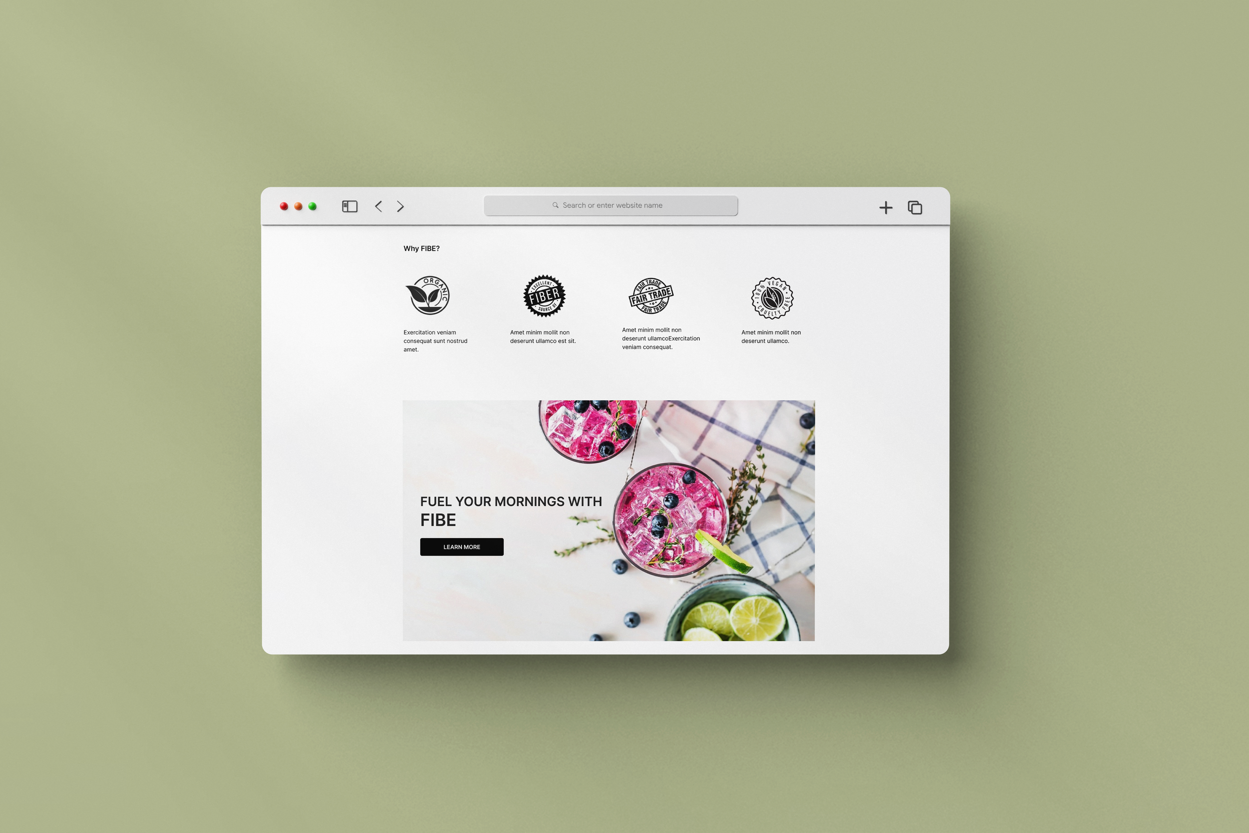
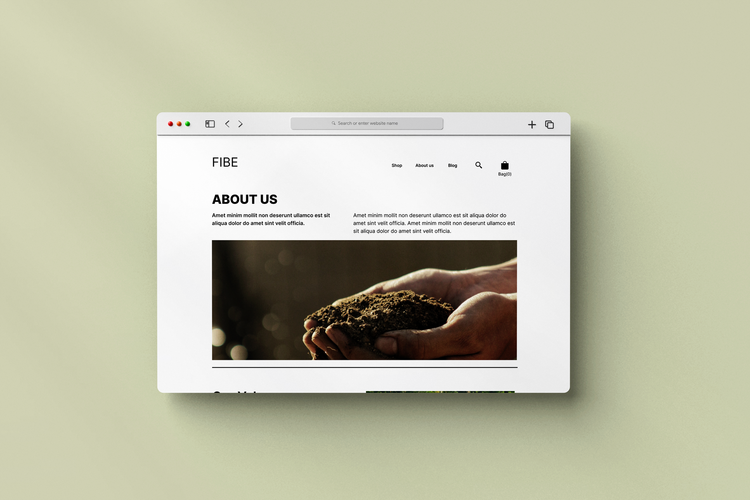
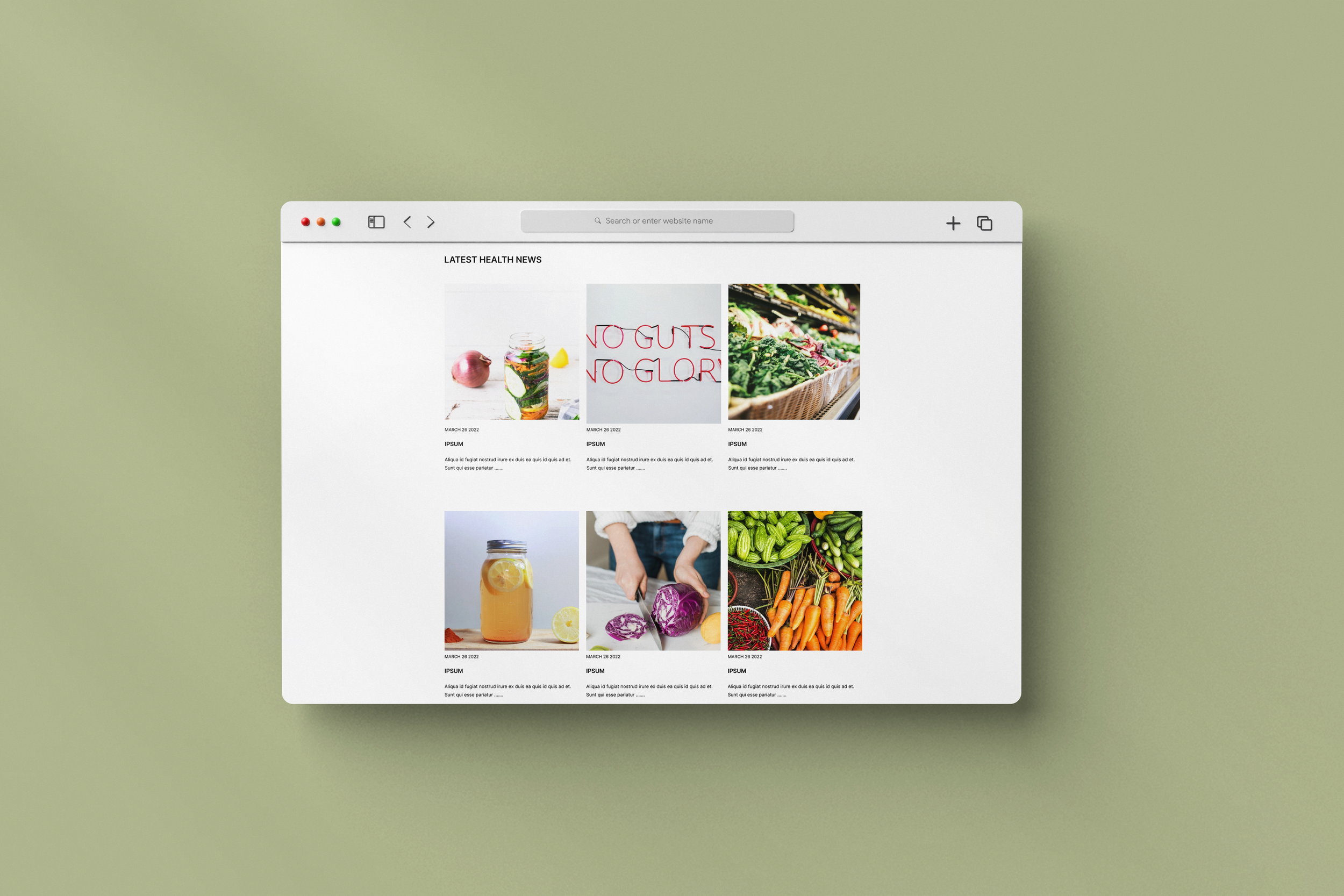
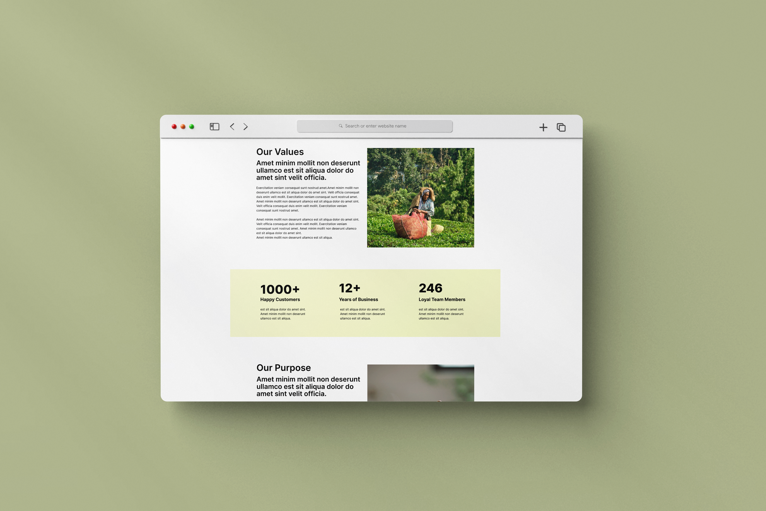
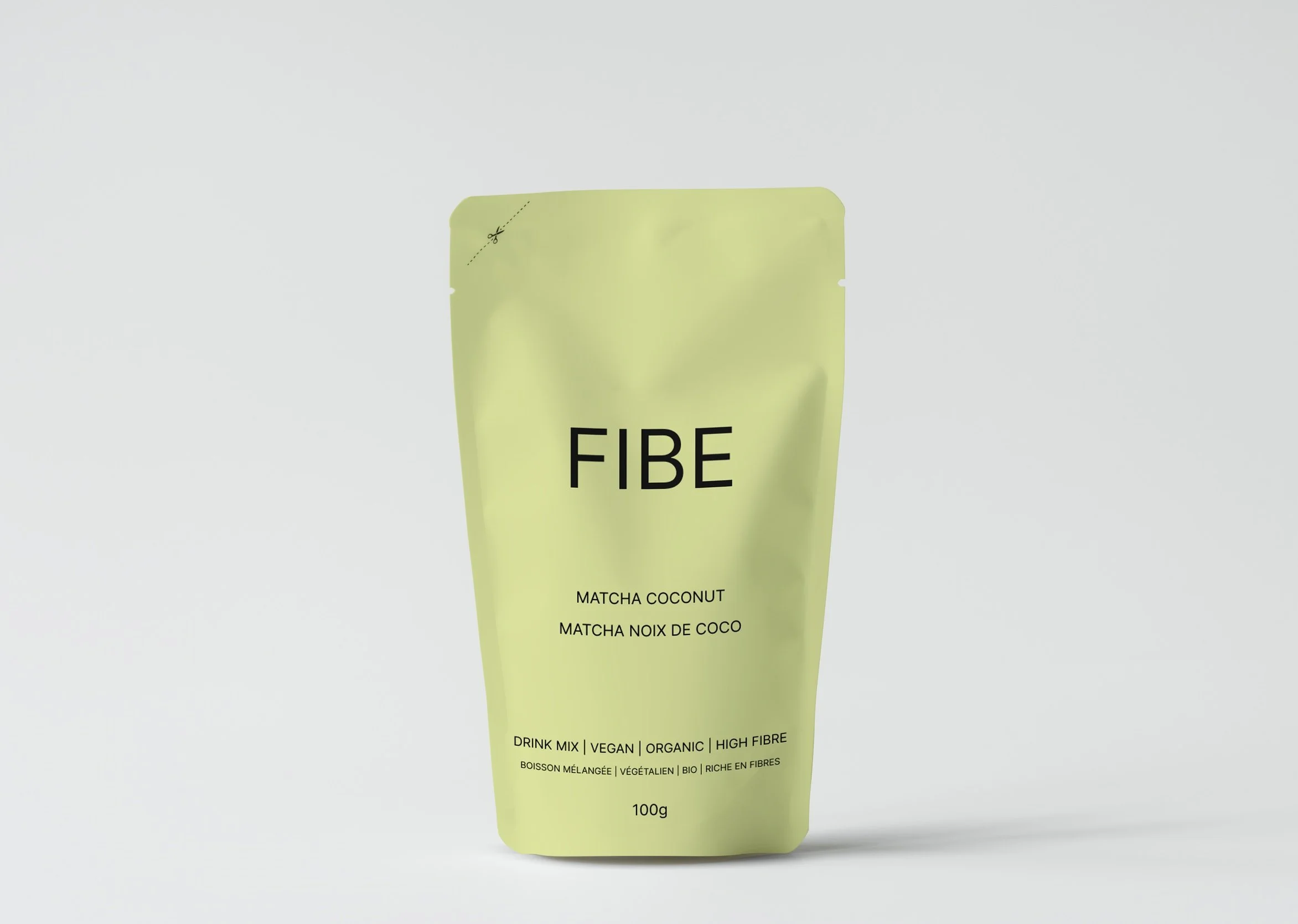
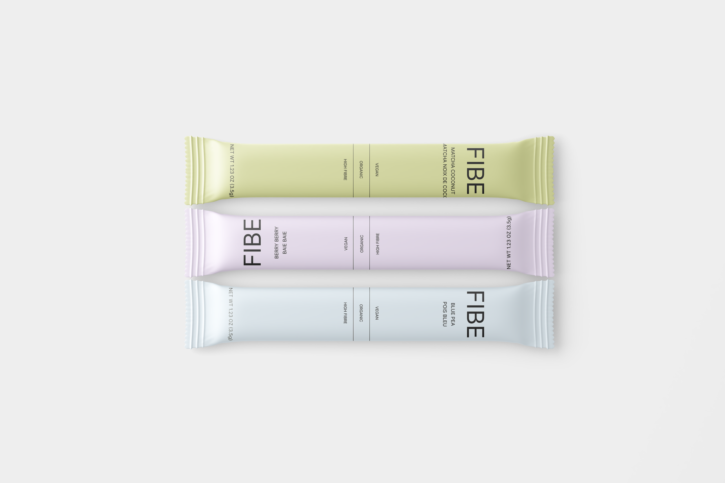
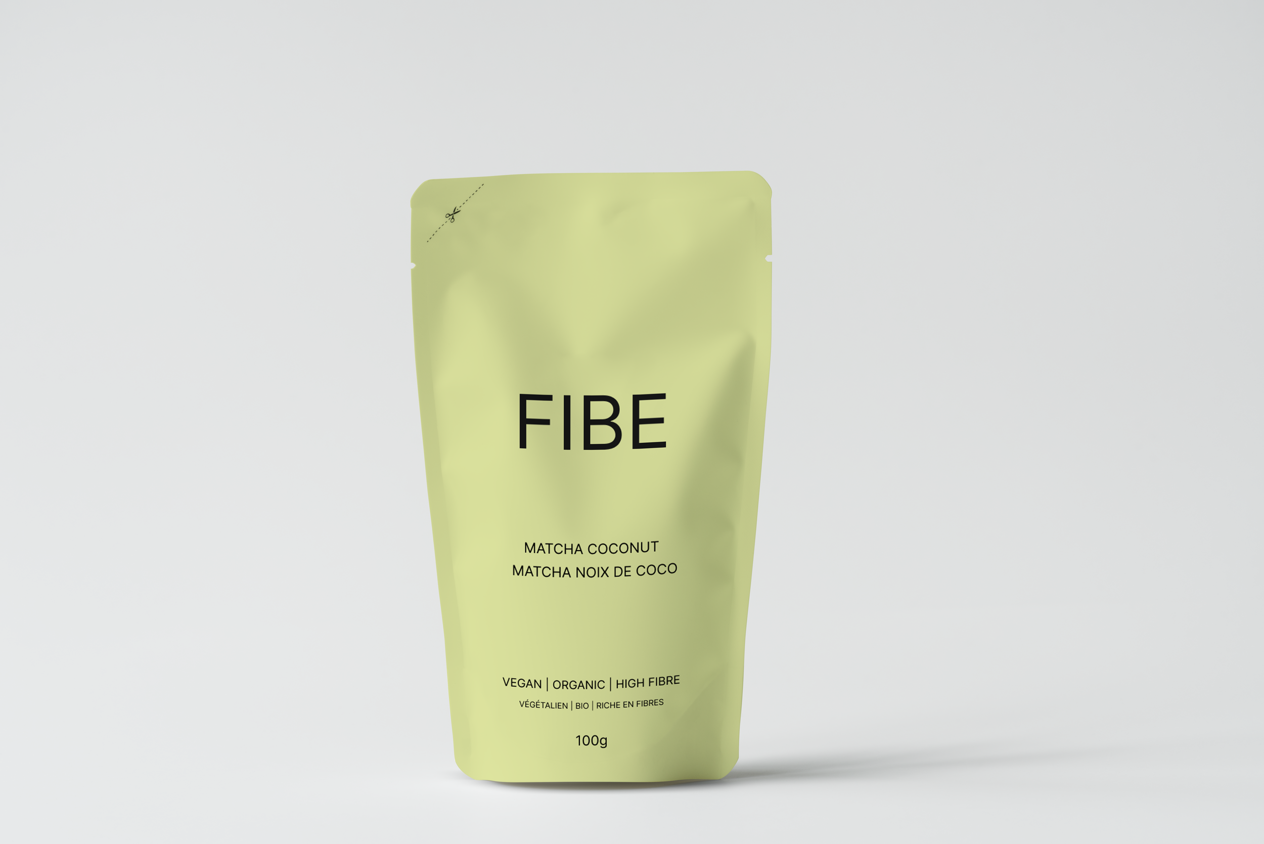
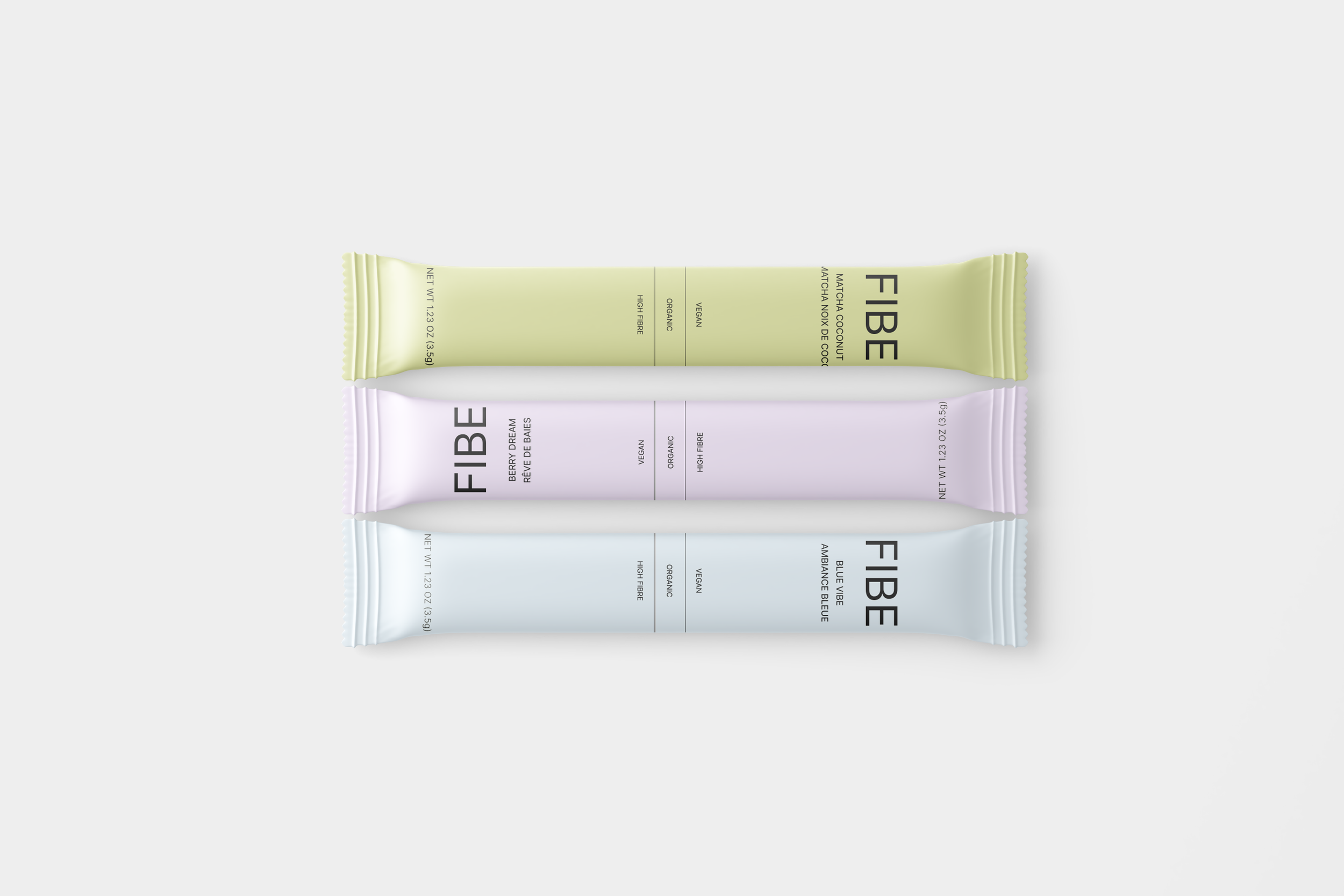
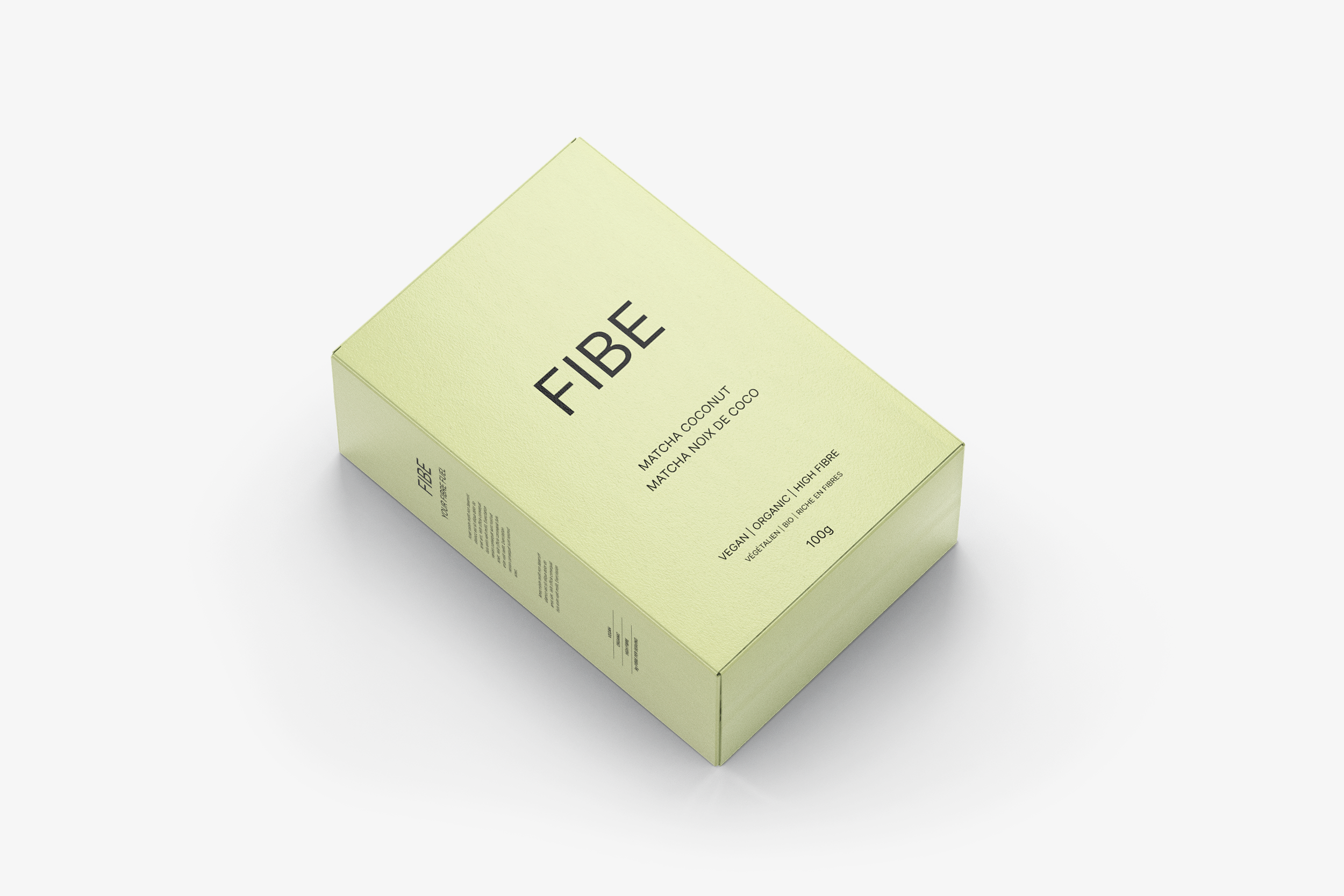
Upon the first usability test, users were not sure of what the product was at first glance. So, I redesigned the package and introduced more images on the web design to illustrate the product vision: fibre, health, and simplicity.
After updating the design and introducing more visuals, the product vision was more clear to users. In the first usability test, 70% of users did not want to know more about the product or complete the user journey. After updating the design, and testing 4 different packages, more than 50% of users said they would buy the product after the update and completed the user journey.
The product validated the importance of imagery and how information is best kept short and simple.
Users want to feel that they are making a good and healthy decision, and want to feel that they are knowledgeable when making a purchase.
I believe that there is much I can improve on this case study; moving forward, I would continue to iterate the design and make the purchasing process flow shorter by introducing quick checkout, a subscription feature, and more.