

Objective: Revise and Iterate main shopping screen components and assess the impact on current and future user engagement.
Goal: minimize error rates and streamline purchasing process.
Current State
SITEMAP
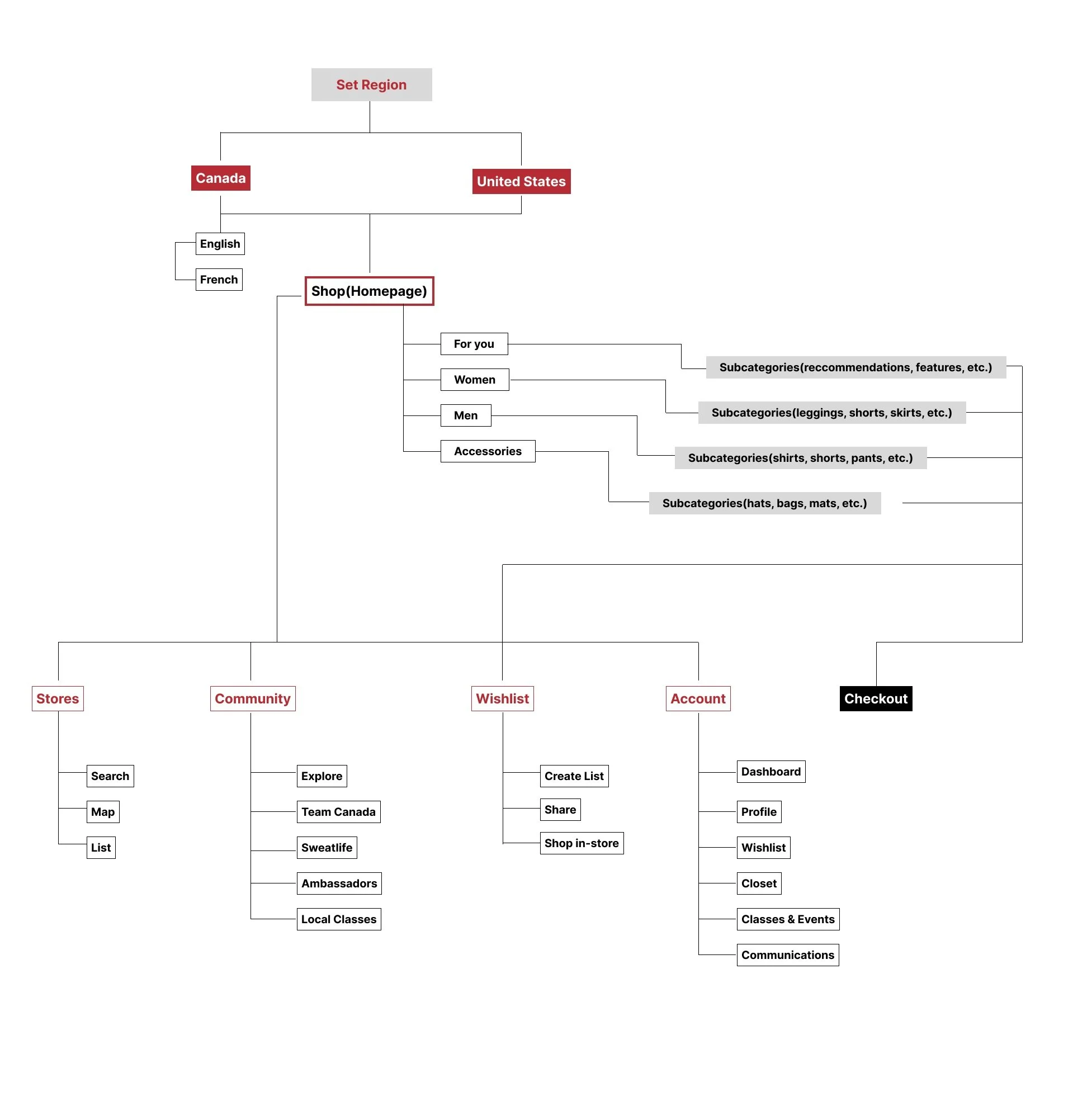
USER SCREEN FLOW
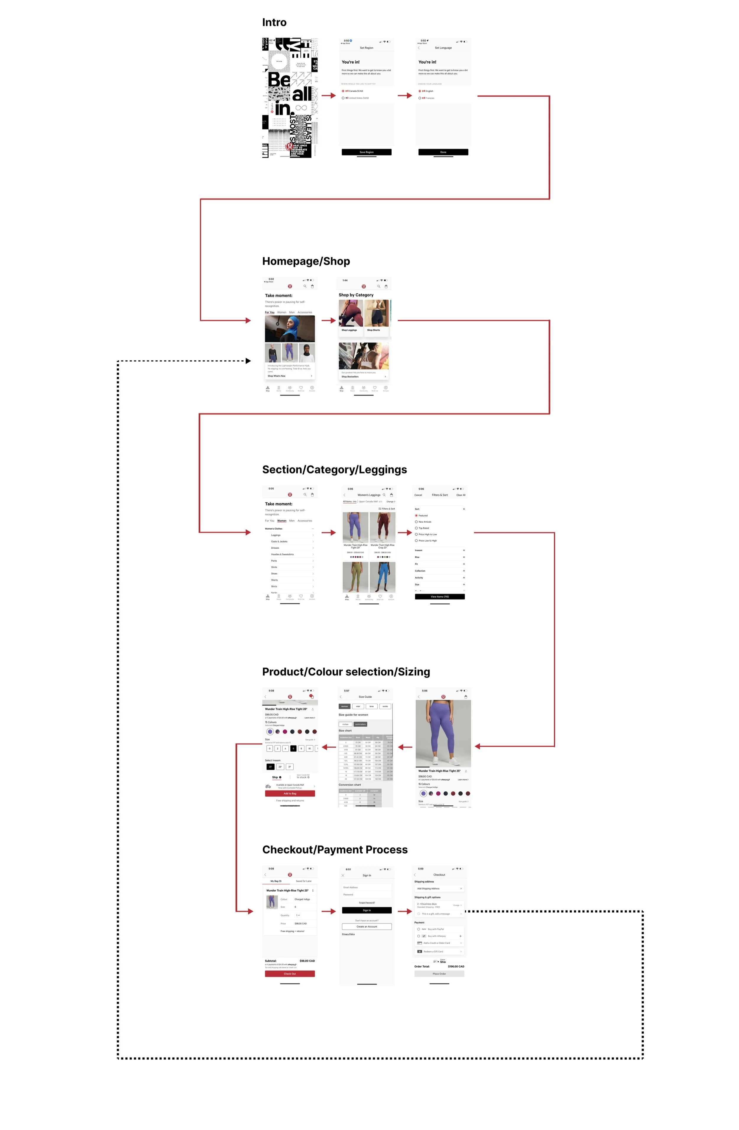
Redesign Process
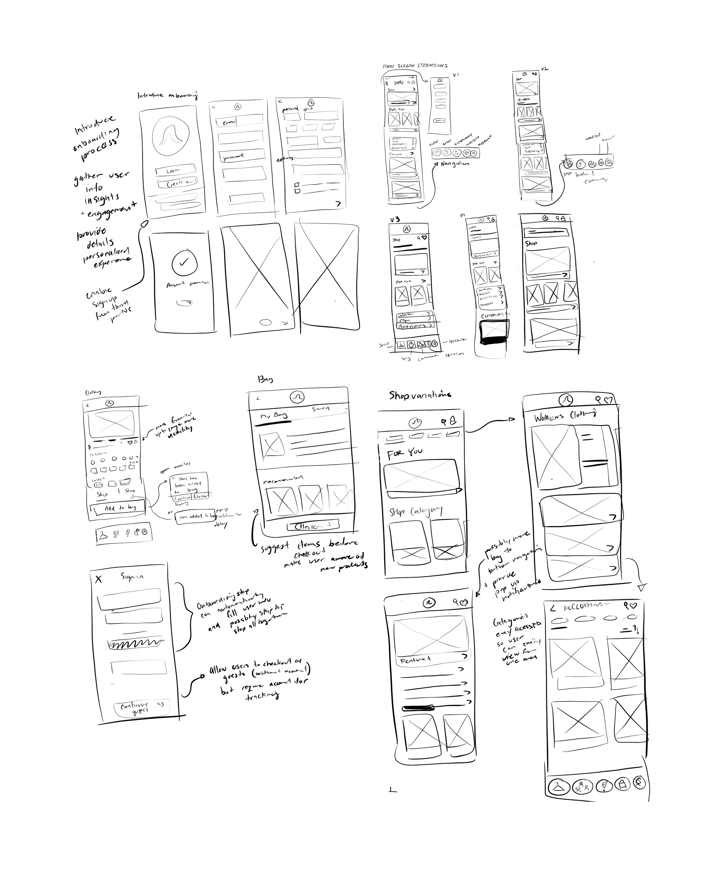
WIREFRAME SKETCHES
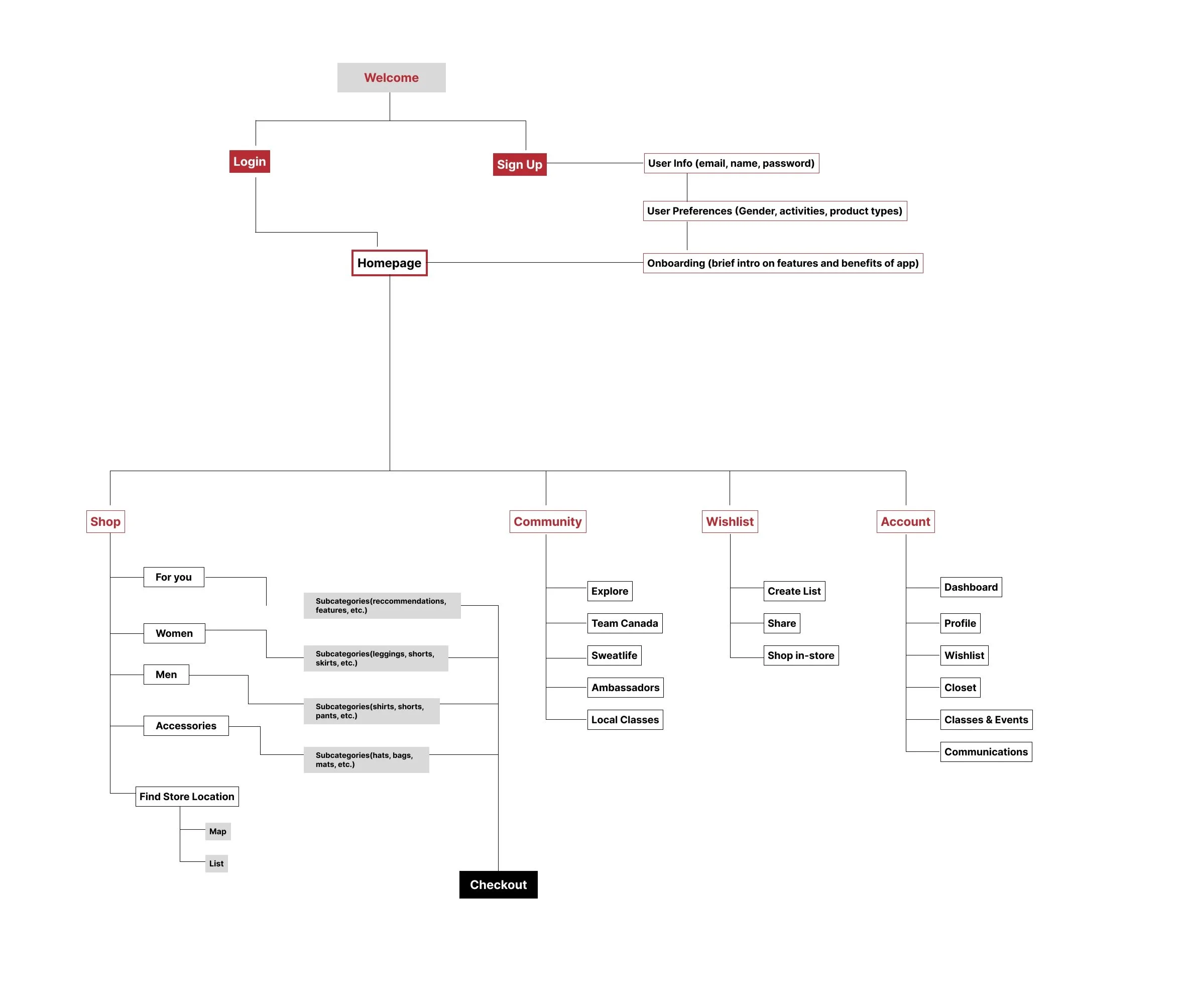
SITE MAP REVISION
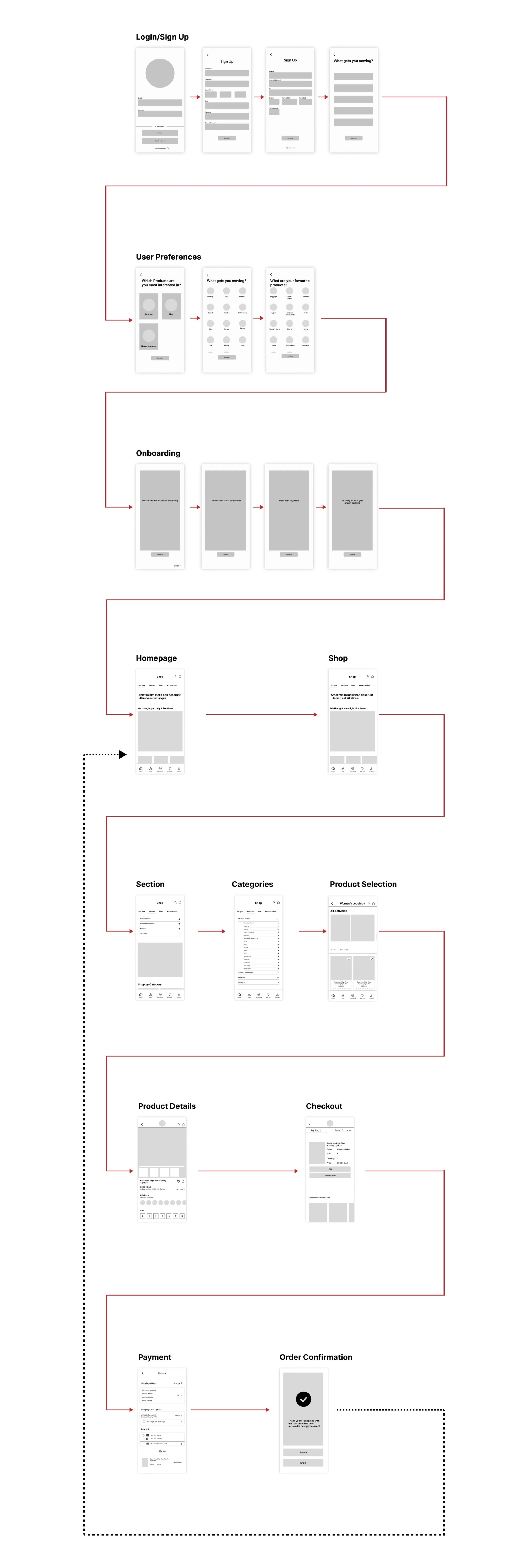
MID-FI SCREEN FLOW
USABILITY TESTING
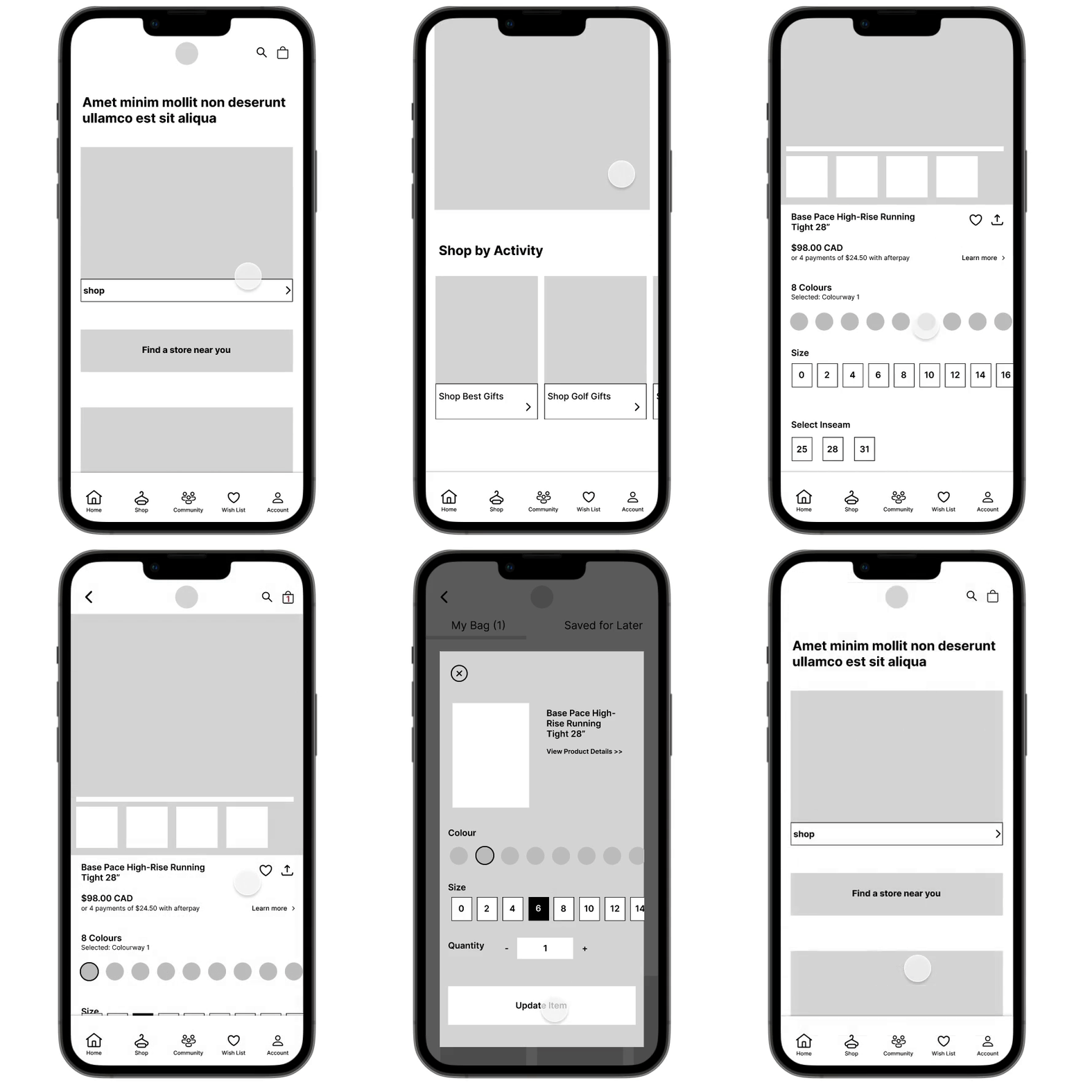
Unmoderated Usability Study
5 Participants were assigned a list of prompts to complete and record their interactions.
Prompt 1: Open Lululemon App. Begin the signUp process.
Follow up: Was the task easy or difficult to complete?
Prompt 2: Locate the Shop and browse products.
Follow up: Was the Shop page easy to navigate and distinguish from other pages?
Prompt 3: Select a product then browse the different images available of the product model.
Follow up: How do you feel about the image layout? Describe features you enjoy and ones that could be improved.
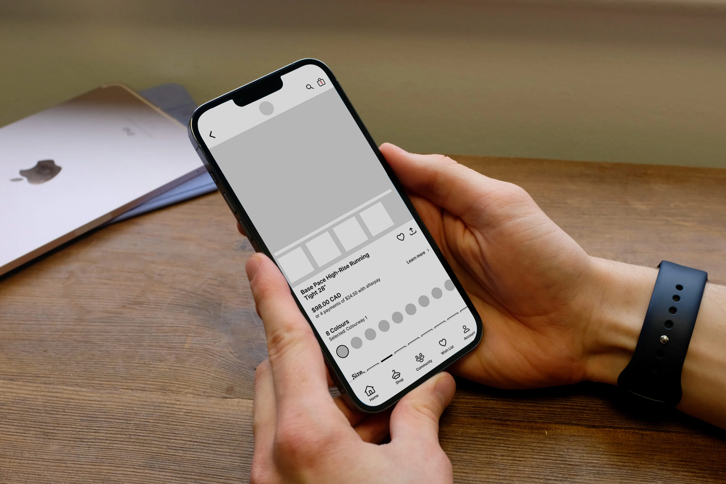
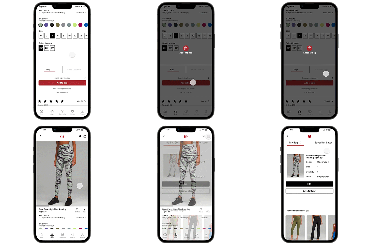
Prompt 4: On the current product page you selected in prompt 3, choose a size, color, and length. Then add an item to your bag
Follow up: Were you able to identify when an item was added to your bag? Did you find it easy or difficult to notice?
Prompt 5:With the current item in your bag edit the size and color of the product.
Follow up: Was the edit option intuitive? Describe any features that made it easy or difficult to complete the task.
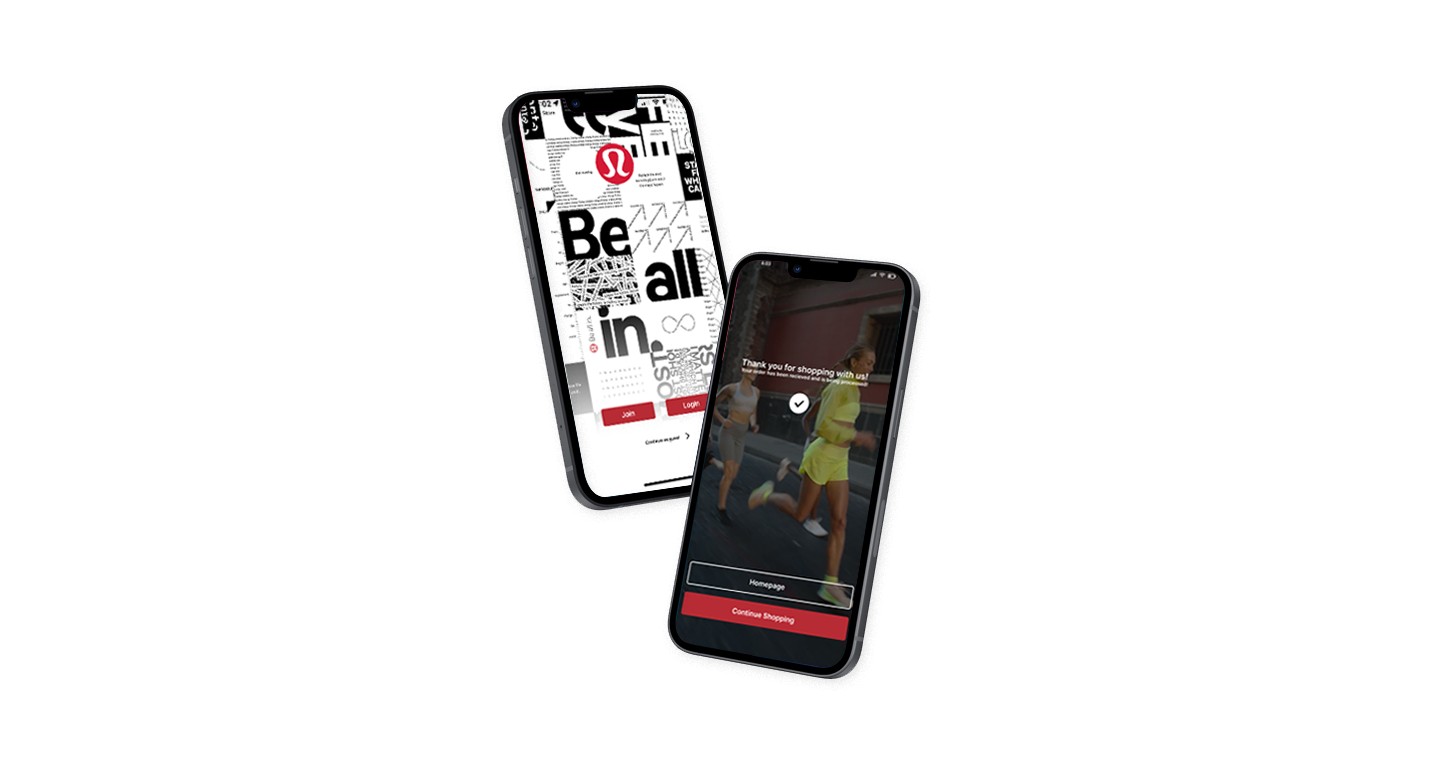
Prompt 6: Complete item payment and checkout.
How do you feel about this app experience? What did you like or dislike about it?
User Insights
60% of participants found the signup process to be long.
100% of participants found the app easy to navigate.
80% of participants found it easy to identify when a product was being added to their bag.
80% of participants found the edit in bag/ checkout option to be useful.
60% of participants were not sure if the edit was completed after updating. A notification could be added to reaffirm users’ actions after editing product colour, size, + quantity.
Final Iteration
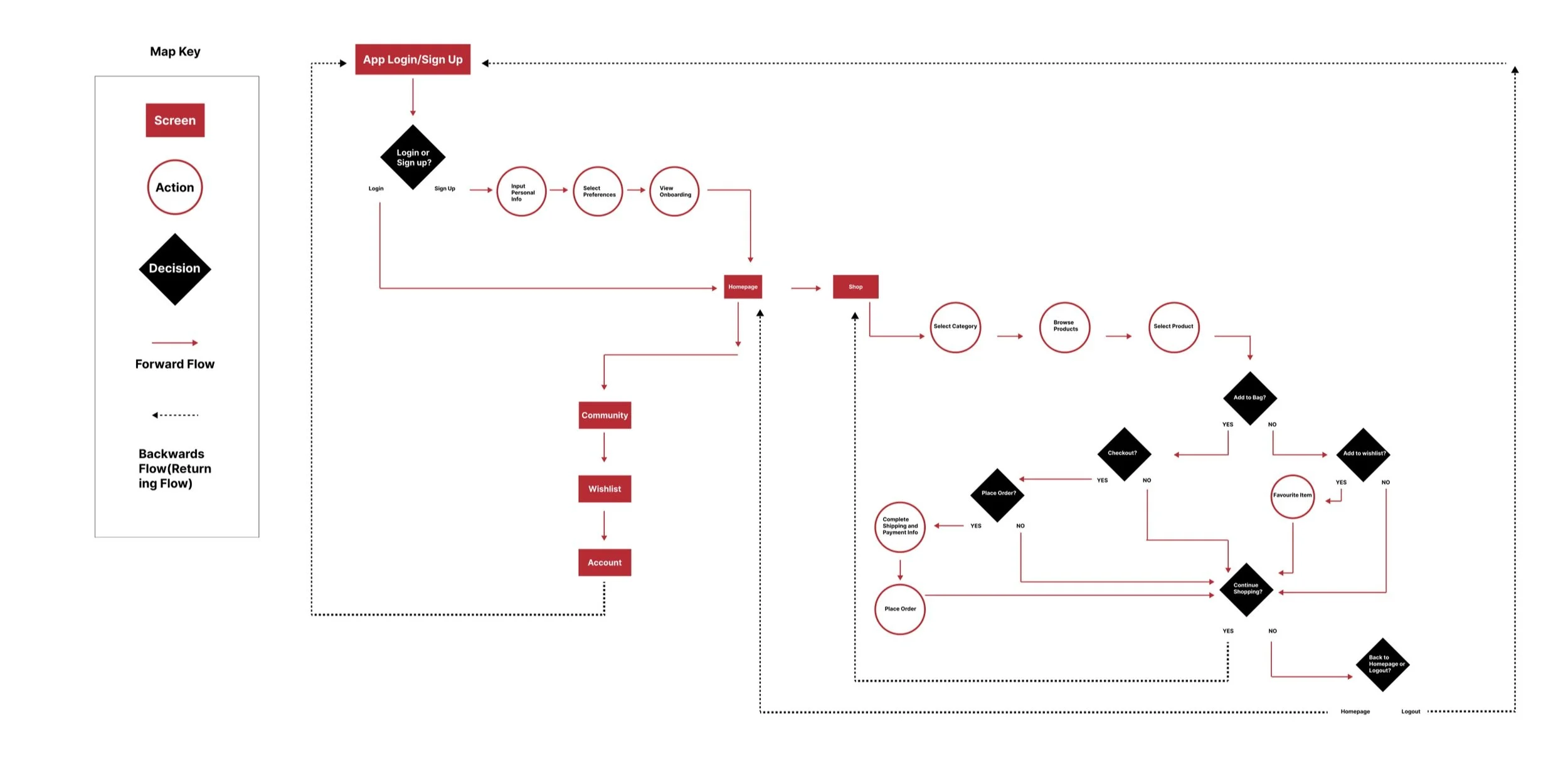
USER FLOWCHART
HIFI SCREEN FLOW
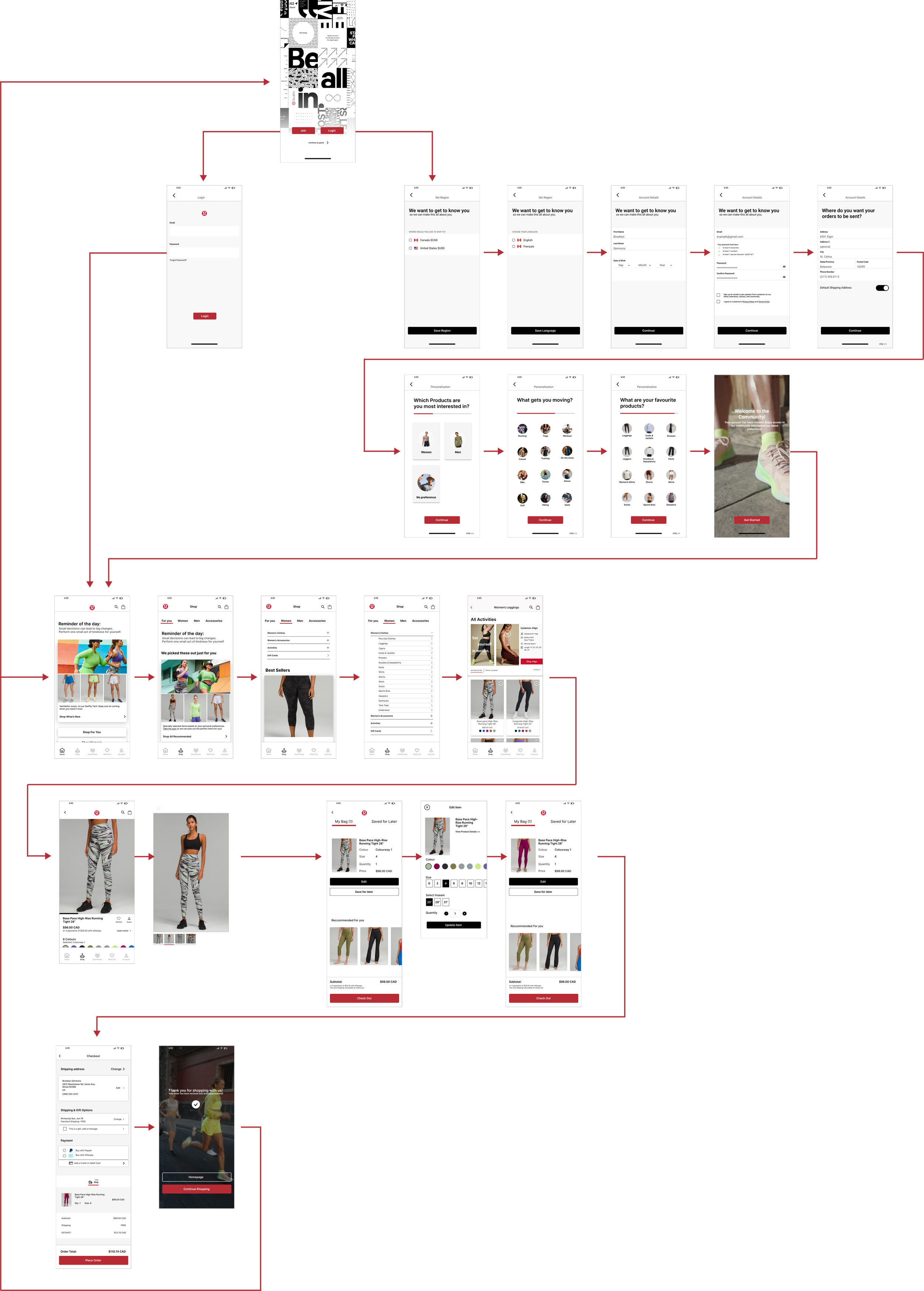
Final Design
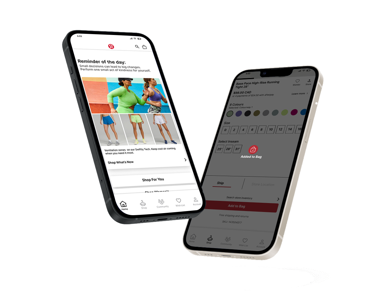
UPDATES
-
Onboarding
Users will be prompted to fill out personal info and select preferences to simplify the checkout process and personalize their shopping experience.

-
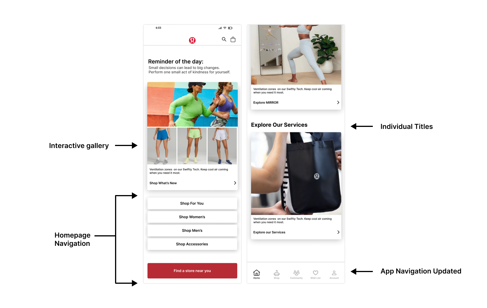
Navigation
Restructuring hierarchy into a more intuitive and predictable flow for users.
-
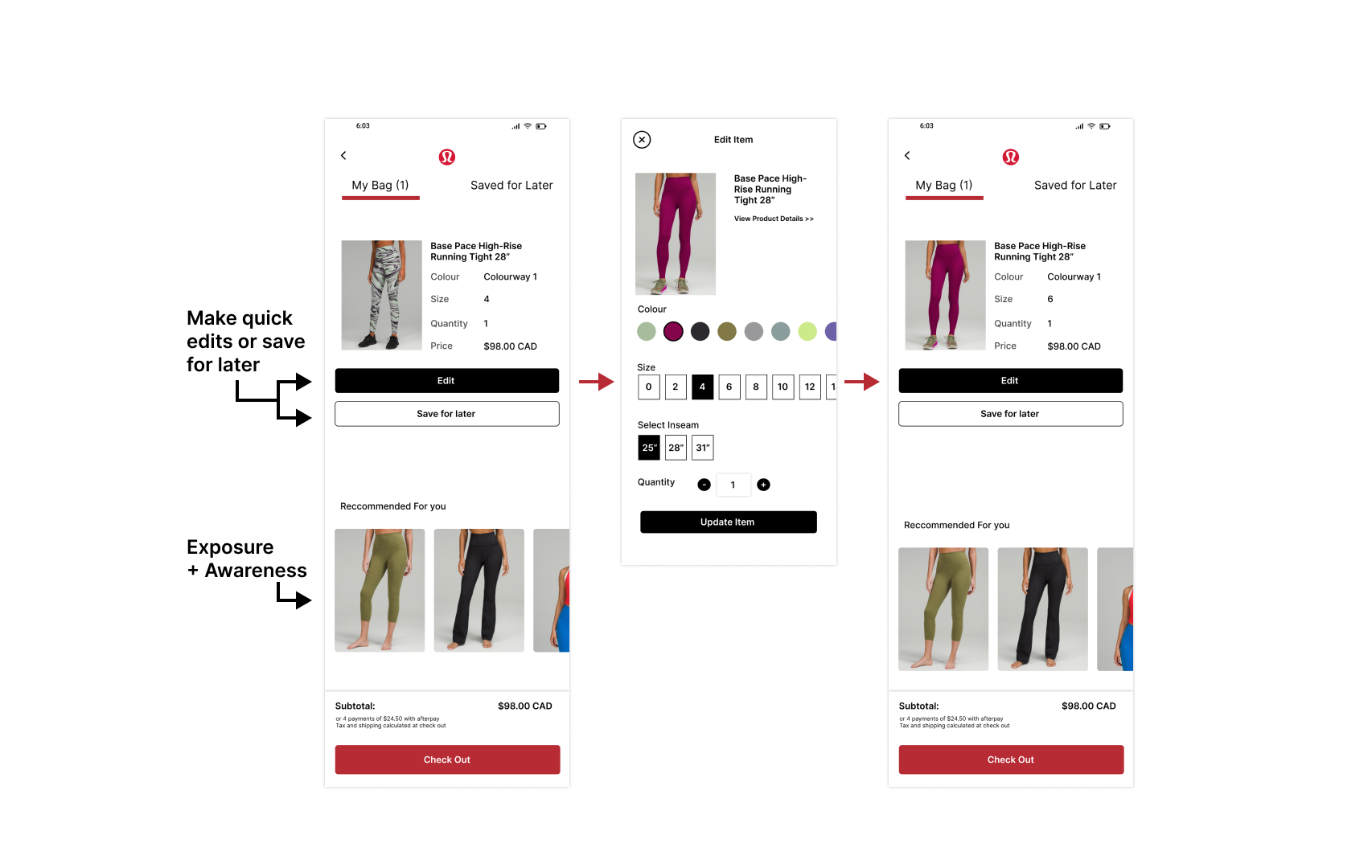
Minimizing Error Rates
Users can easily edit and review items before checking out to ensure correct sizing and avoid potential returns/exchanges.
-
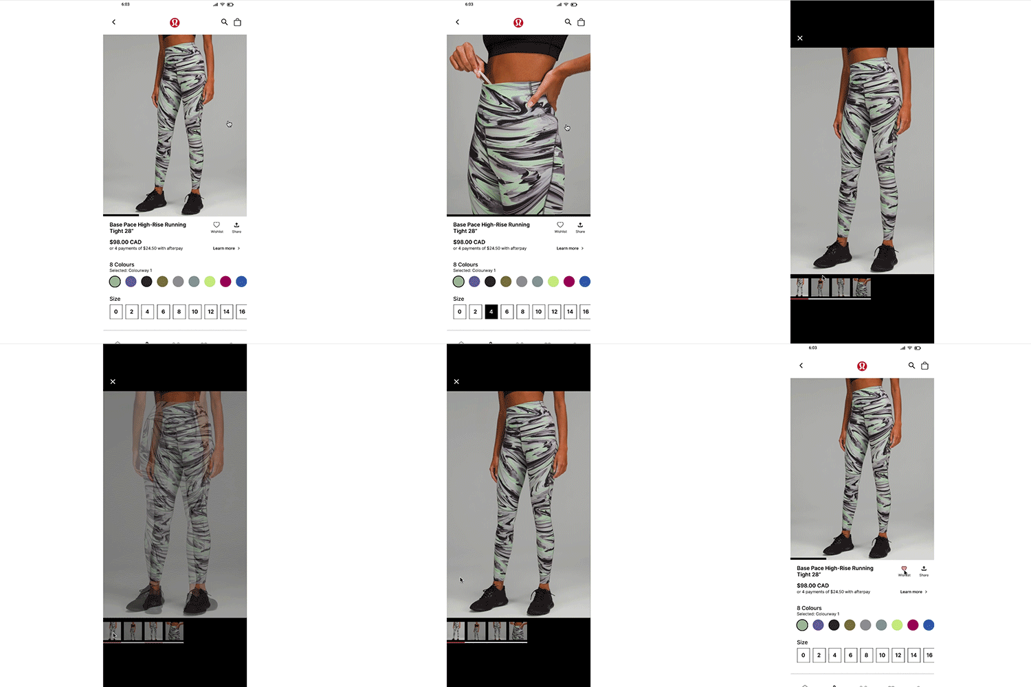
Accessible Gallery
Users can access a full gallery view and preview how many images are available + favourite items with a more visible and usable button.
KEY FEATURES
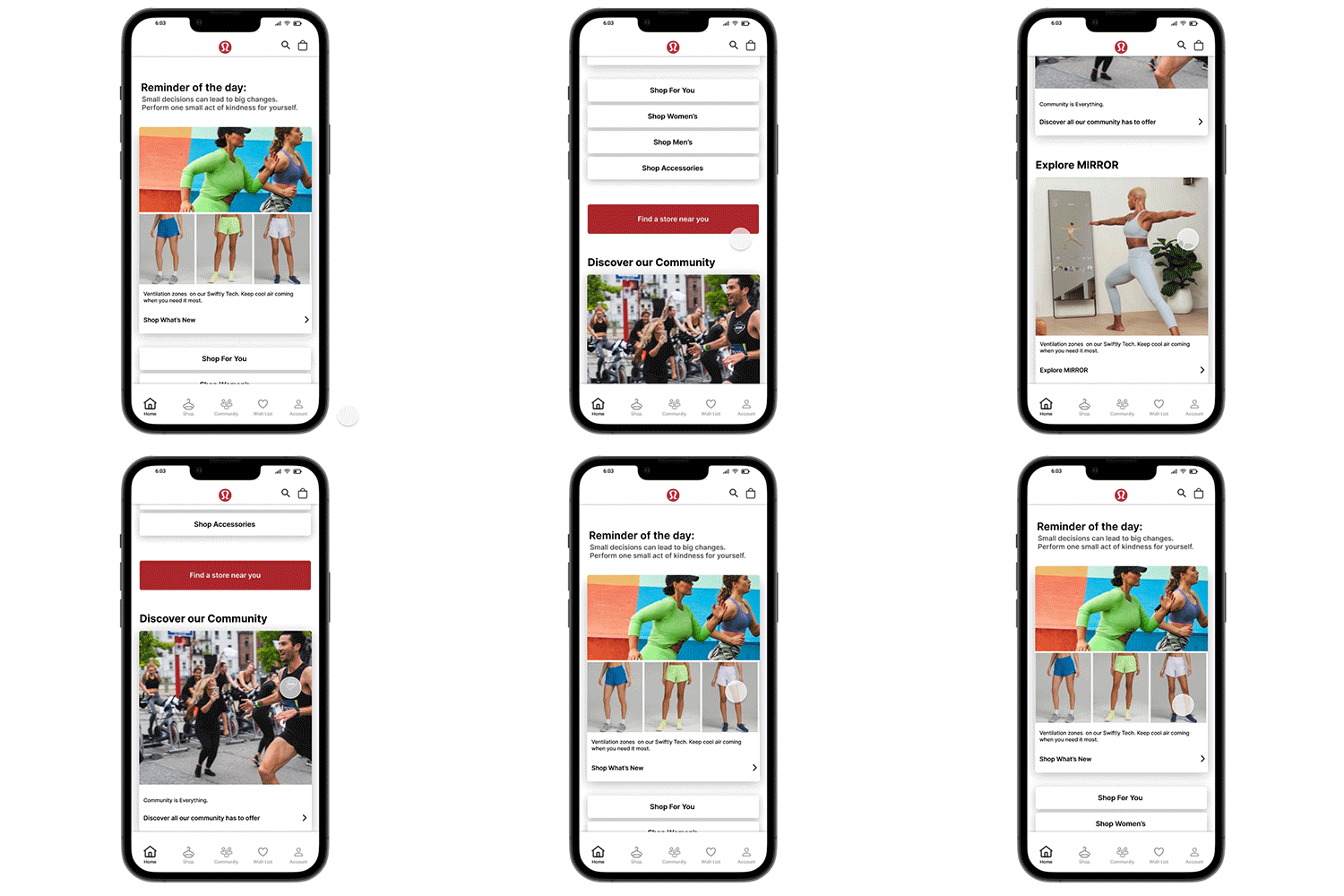
Discover all the app features and benefits from the new homepage and seamlessly navigate between pages.
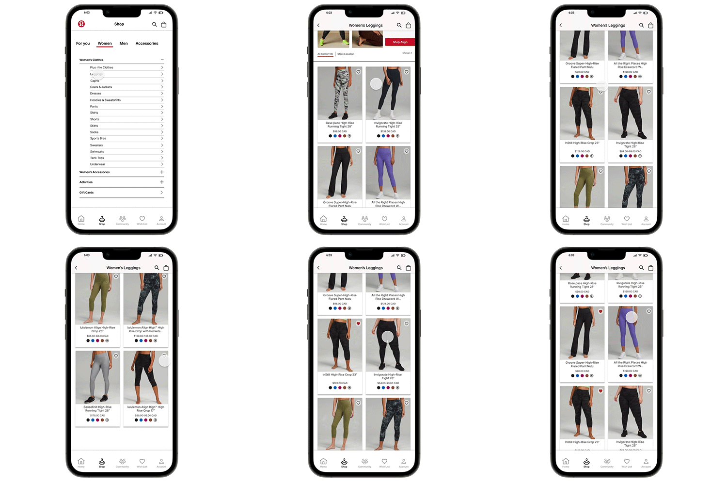
Simply favourite items while browsing.
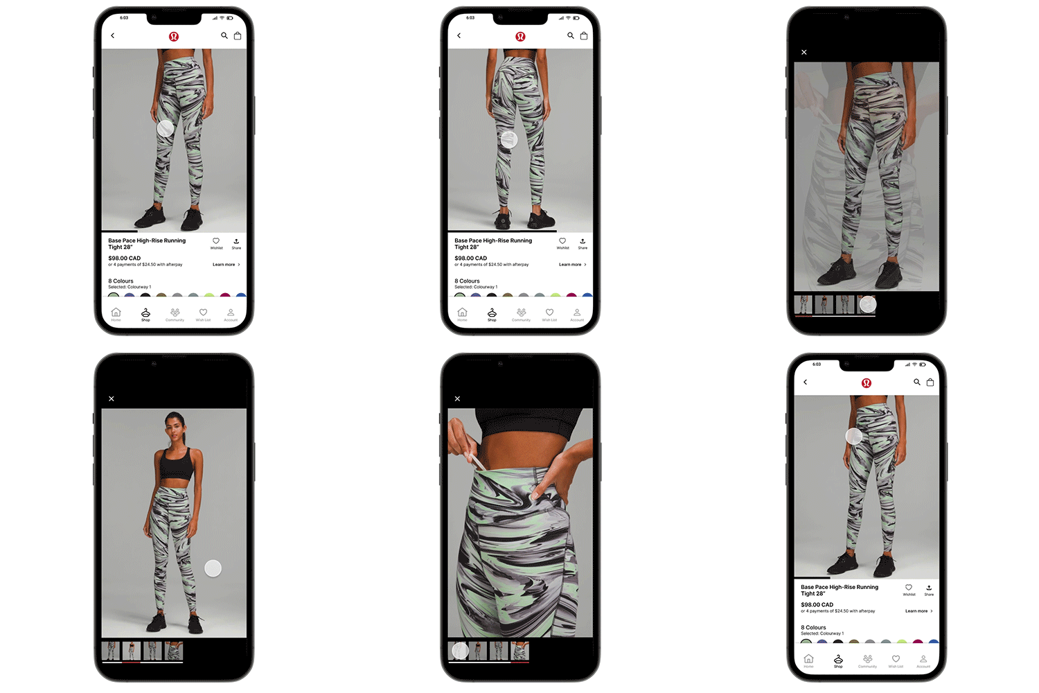
Get the full gallery view and easily toggle between images.
Clearly see when an item is being added to bag.
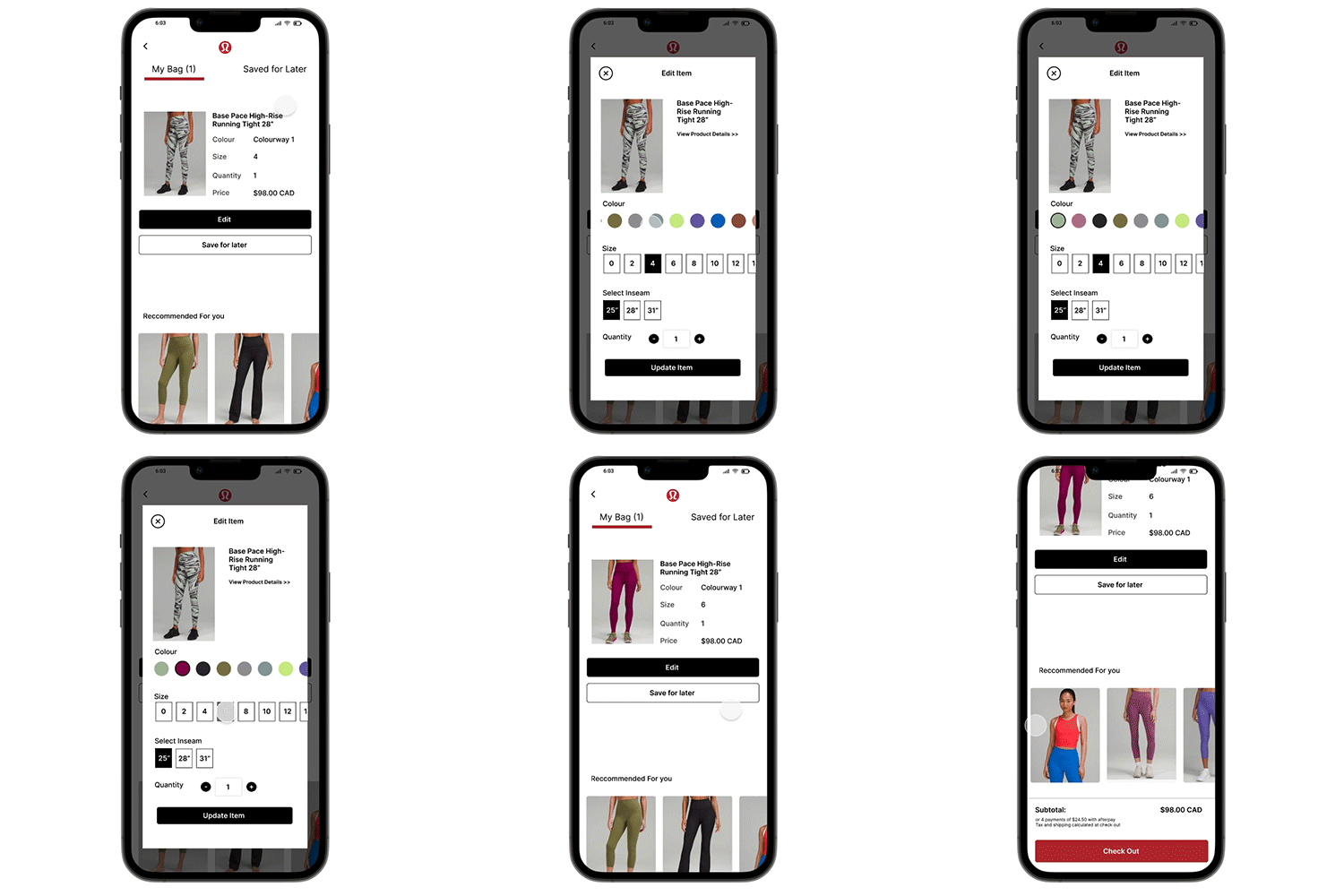
Comfortably edit colour, sizing before checking out.
REFLECTIONS
Overall, my main goal was to ease the mobile shopping experience for frequent users.
By implementing the onboarding process Lululemon can conveniently gather information and insights on users’ behaviors, needs, and motivations to enhance the shopping experience + Homepage to increase user awareness of the app’s features and offerings; overall simplifying the user experience.
If I were to launch this update I would continue to validate the design with A/B testing by comparing the current Lululemon app with my redesigned layout in order to see where my design falls short and what features users would want to see more of.